
In 1988 I had just moved from Art Editing The Listener Magazine, a BBC publication with a strong tradition of using illustration as a means of dealing with often complex political and social subjects, to the Observer Magazine, the Sunday supplement of the Observer newspaper. I was Assistant Art Director, with responsibility for illustration. It was a new team at the magazine, put together by the AD, John Tennant. John had recently joined the magazine from being Michael Rand’s right-hand man at the Sunday Times Magazine, and he wanted to inject vitality and freshness to make it more than just an also-ran to the market-leader.
In the couple of years that followed we took a bold approach – we illustrated a whole feature on Ronald Reagan’s extraordinary “Star Wars” initiative, using Peter Brookes, Ian Pollock, Huntley / Muir and Jeff Fisher among others. We commissioned Brad Holland and Matt Groening (in his pre-Simpson days) and asked fashion illustrator Mats Gustafson to draw a portrait of Gore Vidal. We had fun.
We hit on the idea that our regular columns should be a showcase: Sue Arnold’s funny and spiky column (think Lucy Mangan or David Mitchell) would be illustrated by one artist in four-week slots – that would give 12 people throughout the year a month-long commission and a chance to have a themed set of work. For this slot, we used illustrators who were just getting established.
For our other weekly column, on wine, we decided that it would be great to use the talent emerging from art schools across Britain, giving 52 first-time job opportunities a year. We didn’t want to be prescriptive for either commission – we specified the finished size and left it at that. Of course, this resulted in some confusion. Still in art school-mode, some illustrators gave us four finished illustrations to choose from, as if it were a project with a crit at the end; artwork painted on bottles of wine; oil paintings that had to be reduced by 400%; collages of daunting complexity for the 50mm by 70mm space…
It was a fantastic time that came to an end when the entire art department resigned over the decision to back-date a pay cut for our freelance designers – they’d worked in good faith for an agreed fee. With the insouciance and arrogance of youth, we all figured we’d get another job without too much trouble. My colleague Shem Law (now Deputy Editor and Art Director of Radio Times) discreetly phoned a cross-section of the illustrators who had worked for us and asked them to paint portraits of me for a leaving card.
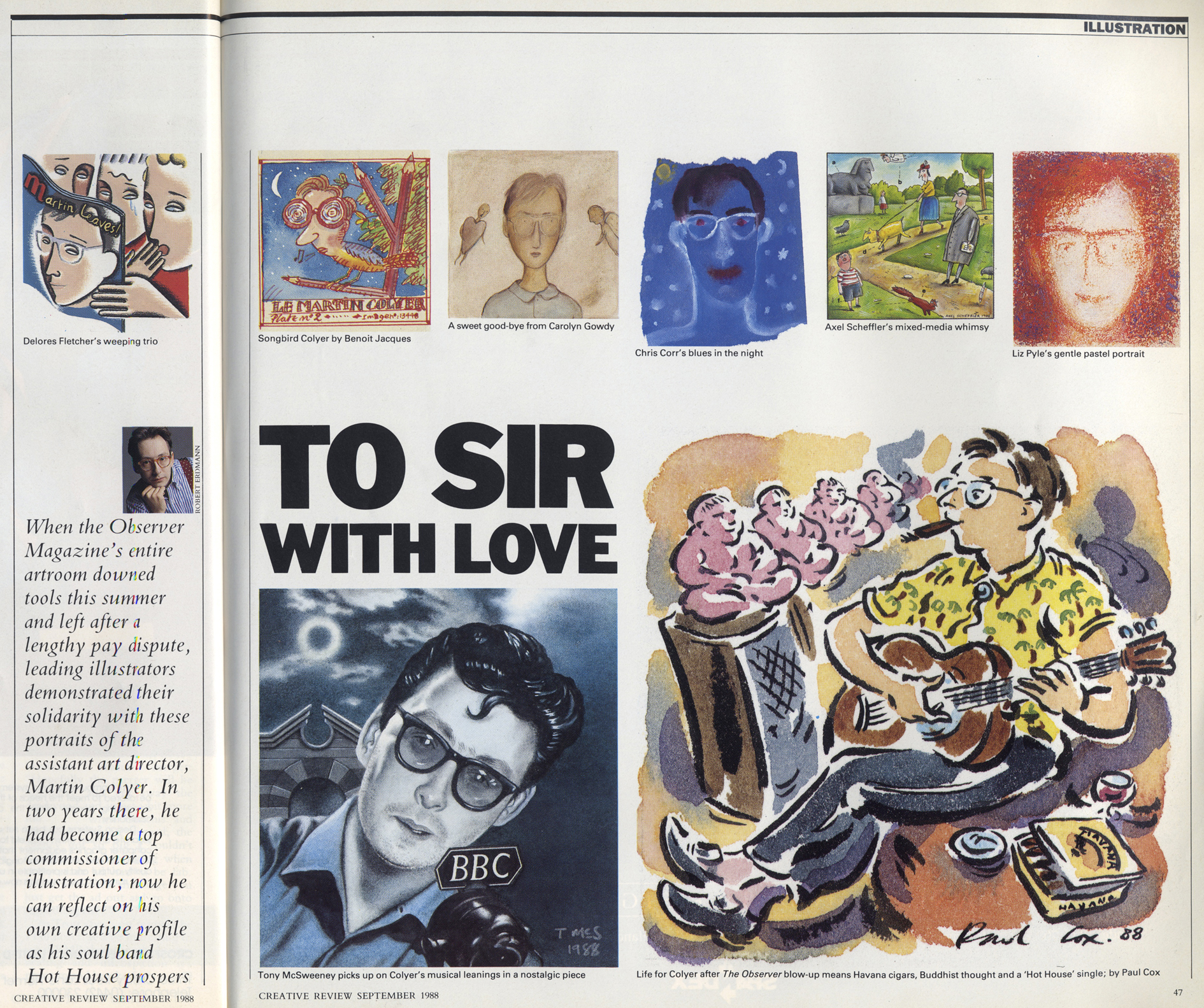
The resulting work provided a glimpse into the world of illustration as it was at that time. Creative Review ran a selection of the drawings and carried the story [the references to music in some of the responses was because I had an alternative career going on at the same time…] While thinking of potential features for an issue of Varoom! on the theme of nostalgia, I thought of that leaving card and wondered what those involved could remember of that period in their lives, and how their careers had subsequently developed, so I tracked down their emails and asked if they’d answer a series of questions.
1) Where were you, professionally and personally, in 1988? [i.e. just starting out/just left college/established].
2) If you came through the art education system, what was your experience of the way illustration was taught? If you didn’t, how did you arrive as an illustrator in London in the late 80s?
3) What do you look back on fondly about that time in publishing?
4) Do you think the place of illustrators or cartoonists has changed in the intervening years?
5) Can you pick one favourite or important project from your 30-plus year career?
[Optional!] If I asked you to sum up your career in one sentence, could you?
Over the coming weeks, I’ll post what those who answered told me about life in London, publishing, and illustration in the long-gone days of ’88.


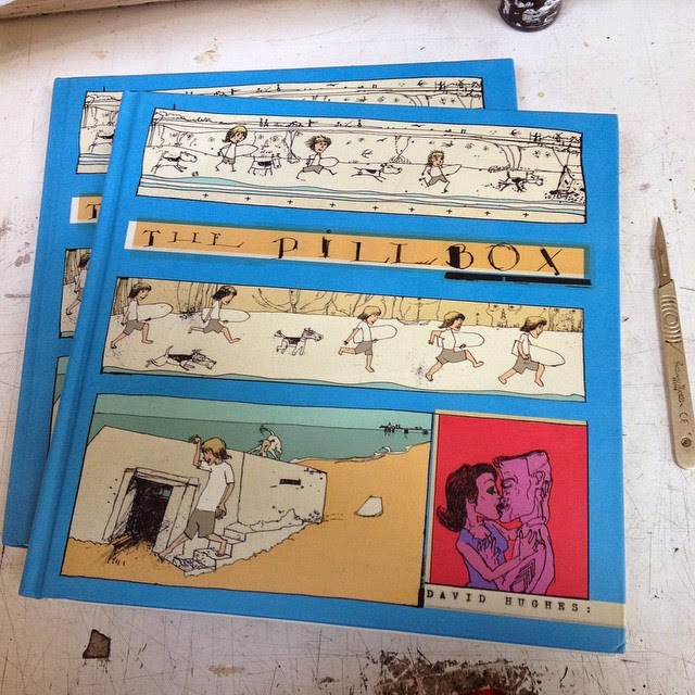
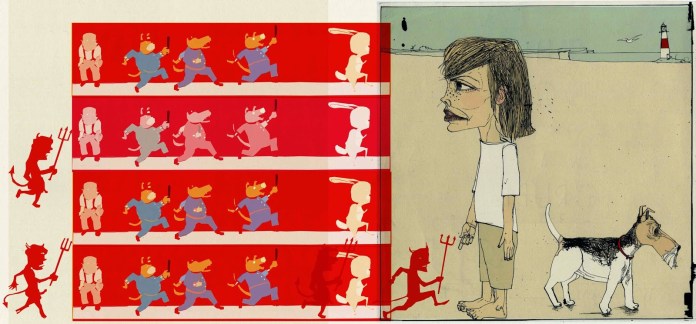
 Hughes’