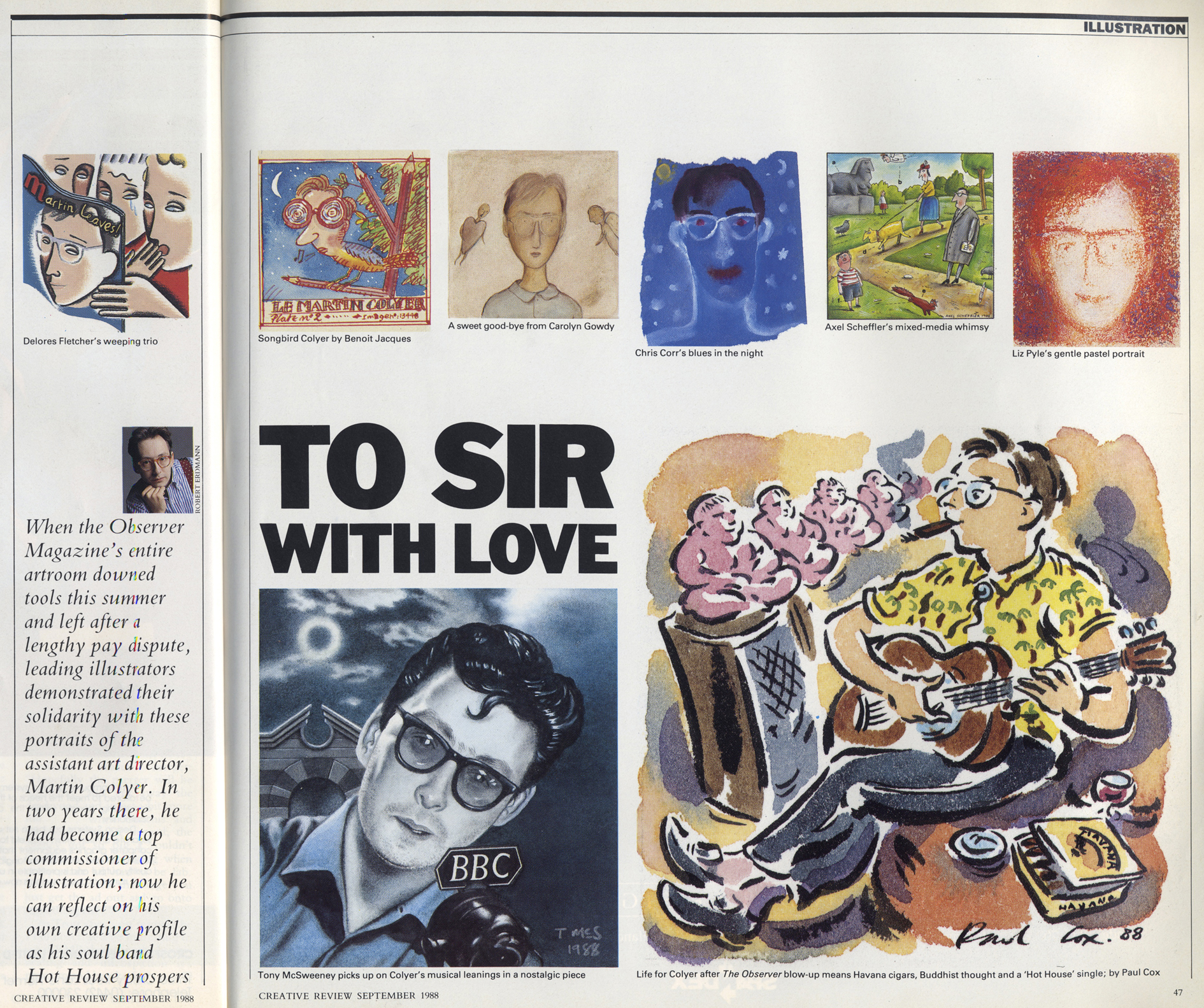
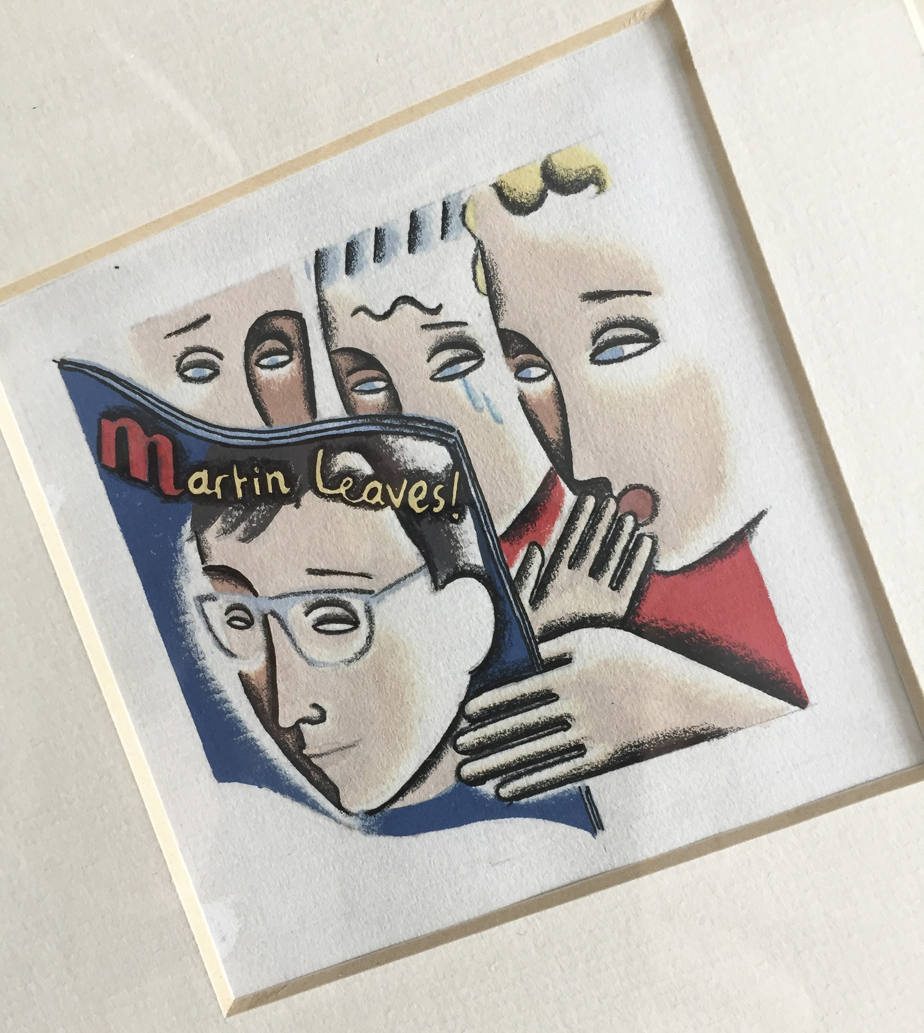
Dolores Fairman (now Phelps)
1 I had graduated from Kingston in 1982, with a varied portfolio that included magazine design, animation and illustration, in a generally punk style. I had no idea what part of the industry I wanted to join; I thought I wanted to be like Malcolm Garrett. But after the usual period of idealistic unemployment eventually found myself working as a layout artist/art assistant in magazine publishing, changed jobs a few times, ending up at Haymarket [Press, publisher of trade magazines] with Swiss typographer Roland Schenk as my cranky, infuriating – but supremely talented and highly principled – boss. My partner Kieren Phelps was illustrating full time for various clients such as the Radio Times and The Listener, and never went out on weekends – always working! I decided I must change my 9 to 5+ drudgery and that if I could get just three black and white illustration commissions a month, I would be earning the same as I was at Haymarket. I was lucky enough to be living in what they called a ‘short term let’ in Limehouse, a council flat with less than perfect amenities, so I had been able to save £1300 with which to launch my freelance career.
I stopped work, spent six weeks putting together an illustration style (I had two styles at first actually) and a portfolio of speculative work. I then raided Kieren’s list of contacts, made notes from the mastheads of magazines in WHSmiths and spent time on the phone getting names of art editors from reception staff of various publishing companies. The first jobs came from the Nursing Times, from a very lovely art director, Hussein Mohamed, who had given Kieren a lot of work and who often had black and white pages that needed livening up with illustrations. Being a weekly, deadlines were short, and it was a great practice ground. My big break came when I got a chance to see Martin, John and Shem at the Observer. I got the Sue Arnold series in June 1986, and it was one of the proudest moments of my life! One of the images is still in a frame in my house.
By 1988 I guess I was quite established though – in a meteoric rise kind of way. I had an agent (Sharp Practice) and was earning high wages doing advertising and corporate work. I was regularly working for The Observer, Radio Times, Sunday Times and many women’s magazines. The cracks were starting to show in the economy by the late 80s, and I didn’t know it, but my meteoric rise was headed for an equally meteoric crash!
2 I can’t give a proper answer to the first part as I wasn’t allowed to join the Illustration stream at Kingston. Brian Love (I love you, Brian, but I won’t forgive you for this!) the Illustration head, said: “I see you more as a designer…” I was allowed to do a couple of the drawing modules in the second year at Kingston, though for my third year I decided to pursue animation as a middle way that allowed me more scope for my music-orientated focus. For the second part of this question, see above!
3 Living and working in London, being able to walk into all sorts of glamorous offices with familiarity as if I had a right to be there. The Observer, the Sunday Times, the Radio Times, National Magazine House, IPC tower! Being young and wearing Vivienne Westwood clothes, the feeling of being a part of a generation that had questioned and upturned the depressing, oppressive 1970s and broken through so many social barriers. I guess I was lucky, and to some extent living in a London bubble, but it was very relevant to me and my experience of social mobility, having left a Hastings comprehensive school at 15 with 5 ‘O’ levels, mum on benefits, no support structure except from the State. Where is the support structure now?
4 I don’t work as a commercial illustrator any more, I do personal and research projects and collaborative work, but I am an illustration educator and am in close contact with many practitioners. So my experience is relevant, but no longer first hand!
Form, content, and platform:
Form. I do think that one of the roles of illustration has always been to provide dynamic, graphic interest on the page (or screen) for mainstream publications, that can’t always rely on avant-garde typography or fantastic photography. Neville Brody famously didn’t use illustration, but in a magazine full of huge letterforms, geometric shapes and outlandish fashion, there was no need for it. This hasn’t changed, and the new generation of illustrators seem even more keenly aware of the power of graphic impact, helped by the amazing tools they now have at their disposal, and encouraged by pioneers such as Blexbolex and Nobrow Publishing.
Content. Illustration is about providing a visual solution for a (usually text-based) problem. It’s up to the illustrator to point out where their particular brand of problem-solving will be most effective, and this location is a shifting one. When art directors (and that sometimes, has to be the illustrators themselves) see that illustration will solve that problem, a job is born. But it takes a talented individual to find that niche!
Platform. Illustration commissioning is now so much more international, which gives art directors more choice and makes the industry more competitive. The print magazine and book publishing industry is being financially squeezed (my London Book Fair experience bears this out) and books are possibly becoming less popular as Generation Rent need to be more mobile and can’t lug too many books around with them. This said, the applications for illustration are enormous. Illustration as part of the ‘image-world’ has to compete with any other image, fine art, archival/retro/historical images, photography, textile design. So it’s incredibly competitive and can have a lot to do with entrepreneurial talent and skilled social media use. Then there is social art, street art, zines, clothing, film and TV concepts, production design…
5 Well, I guess it has to be the ‘My Name Is Aurelia’ project, which is 450 or so images visually describing the text my mother left me when she died. She narrates her memories of being a refugee from Spain in 1937, part of the 4,000 other children who arrived at Southampton from Bilbao to escape the Spanish Civil War. For a little over a year up to December 2018, I produced a daily image using various types of rubber stamps and ink-transferred shapes.
From my professional career, I would like to mention the anti-fur charity Lynx, for which I had the pleasure and honour to have designed several T-shirts and other products. The high point of the campaign was a photo I have of Paul McCartney wearing one of my T-shirts!
[Optional!] Visual problem-solver rides crest of new wave into neoclassical modernist doldrums! Or, “It was acceptable in the 80s; it was acceptable at the time…” (Calvin Harris)
As you can tell from her answers, Dolores is smart and perceptive, which is why she’s an excellent communicator and educator. She teaches part time on the undergraduate Illustration course at the University of Gloucestershire. Her Aurelia project is a really wonderful piece of work.