Design etc

Thirteen (b): Neville Brody/Illustrated London News/April 1988

It is very unusual for a graphic designer to be recognised outside of his profession. It happened to Saul Bass, and it happened to Milton Glaser, but not before they had spent many years at their craft, and their high profiles came with prestigious design work for Hollywood films, international newspapers and supermarket chains. When the Victoria & Albert Museum decides to devote the 20th Century Gallery (formerly the Boiler House) to a graphic designer, then, it is remarkable to find that far from being a posthumous show, the subject has only just seen the other side of 30.

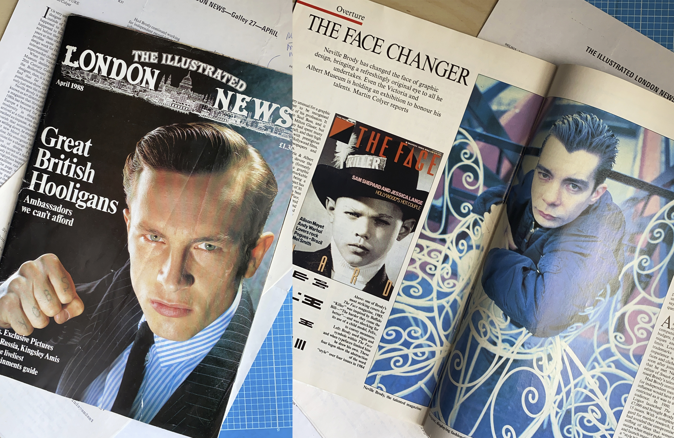
Neville Brody is probably best known as art director of The Face, a magazine that through the mid-1980s has become in America and Europe a byword for style and modernity in design. Brody arrived at a time when magazine design had reached an impasse. As the minor flourish that accompanied punk was settling down, he stepped in to inject new blood into an ailing discipline. His emergence laid the foundations for a change in public perception of design. People started to take notice of a field that had previously left them unmoved. Strange hieroglyphics leapt out of The Face, headlines ran upside down or off the page, offset by symbols that seemed to have strayed from the pages of the Highway Code. As the exhibition, The Graphic Language of Neville Brody will show, he has covered a lot of other ground since and brought the same seriousness of intent to all he has done.

After a fine art foundation course, Brody studied graphics at the London College of Printing, an institution noted for its stringency regarding typography. This provided him with the challenge he was looking for. Everything he wanted to do which flew in the face of prevailing thought had to be forcefully argued. This approach has made him an articulate spokesman for his methods and, like the Dadaists and Constructivists who inspired him, fond of manifestos: “Graphic design is a language, a complete language. Some people are born to it, understand it fluently and can make new sentence structures, or talk slang if necessary. And then there are those who just use phrasebooks—they do not actually understand the words they’re saying, but the phrase solves their questions.”

After leaving the LCP, Brody started to design sleeves for small independent record companies. Working on low budgets, he had to push his techniques and ingenuity to their limits. Looking back now, his trademarks were emerging: his impatience with standard typefaces and clichéd imagery. It was soon after joining Stiff Records that he met Nick Logan, the editor of Smash Hits, who recognised Brody’s talent although it was not appropriate for the pop weekly. Had Brody continued working for independent record labels his influence would have been limited, restricted as it was to a small cult audience. In 1980, however, Logan launched The Face on £7,000 and brought Brody in after 15 issues. With a complete disregard for market research, Logan had avoided the compromise and stifling of ideas that can occur when major publishers plan and launch magazines. He created a “style bible”, read by the bright young things it celebrated, in which Brody’s experiments could run riot, and in so doing change the face of magazine design.

Broken down, the traditional elements of a magazine spread are the article itself, the illustrative material and captions, the headline, the introduction and the credits. Good designers use these elements to create a visual effect that will enhance the sense of the story. This is done through the choice of typeface, which offers clues to the content of the piece by its size and weight, as well as by what it says. Its relation to the pictures brings forth another set of responses from the reader. In this way, the magazine is given pace and structure. Many magazines, however, are designed on a formula basis, applying virtually the same (un)aesthetic reasoning to every type of story, creating at best a characterless whole and at worst an unreadable jumble of images and words.

What separates magazines from other areas of graphic design is haying a regular audience to whom you can communicate ideas and feelings. As familiarity grows, you can use shorthand or prompt readers to look at things differently. The V&A exhibition shows how the appearance of Brody’s magazine developed from issue to issue, sometimes imperceptibly, sometimes drastically, until twice or three times a year you held a radically different-looking magazine in your hands. Brody used numerous signs and symbols, expanded and contracted headlines to startling effect, and when typefaces started to limit him, he drew his own. This led to a unique situation: a designer forced to retain a lawyer just to warn imitators of copyright infringement if they became too slavish. It galled Brody that people could glibly pick up and use typefaces he had hand-drawn for a specific use.

Success does breed imitation though, and at a certain point, The Face design became the perfect phrasebook for entry into the financially attractive world of youth and style. It was used indiscriminately by magazines and advertisers, desperate to appeal to and tap the resources of the youth market. They often missed the fact that although The Face was a guide to this culture, it was also questioning it constantly. The biggest drawback of being so influential was that every move made, every change was examined and criticised and usually, in the end, exploited. As the imitations went from bad to worse, The Face began to look more classical. The hand-drawn faces became more elegant and Baskerville, a doyen of British typography, was used extensively.

By now, Neville Brody was the most talked-about magazine designer in the country. His high profile led to approaches from other magazines. He redesigned the London listings magazine City Limits and then the New Socialist, in-house magazine of the Labour Party. Even politics could not deny the importance of design (and nor should it, Brody would argue). Both these projects were successful outlets for his ideas, but less happy were his ventures into the Condé Nast empire. New York’s Mademoiselle, influenced for some time by The Face, imported Brody to revamp its appearance. His efforts hit a brick wall in the shape of Alexander Liberman, the group’s overall design director. Although he originally approved the choice of Brody, Lieberman rejected the look he had created as not feminine or “pastel” enough. When he went on to condemn the hand-drawn headline face as “pretentious”, Brody caught the next flight back to London.

On accepting the challenge of becoming art director of Tatler, Brody had to work within the hierarchy of an established magazine. This episode was equally short-lived, as parts of the design he implemented were not printed and features were moved out of their allotted places without consultation. Having been indulged at The Face, Brody found the interference unacceptable and swiftly resigned. He returned to Logan’s patronage to design Arena – Nick Logan’s magazine for men, and has managed to keep ahead of his most slavish imitators, although he is amused by the first mimics of its, in his words, “deliberately boring design”.

As design moves increasingly into public awareness, it is essential that a designer who is serious about his work has an exhibition – heaven knows, enough kettles, frocks and carrier bags have been put on display. Design has now assumed what amounts to a stranglehold on the manufacturing and service industries, and Brody is not impressed. He considers that design “has gone off the beam. Ten years ago ‘designer’ was a dirty word because most design was anonymous, and now ‘Design’ is a dirty word to me because everything is designed.”

He sees the rise of the large design consultancies resulting in creations such as the new Midland Bank in Oxford Street. “A marriage of money and design, the perfect church for the 80s.” This adaptation of design as the crucial selling element is nothing more than “manipulation by flattery” in Brody’s words. He views the immediate future as a battle between the major design groups who “hoover up college graduates” and pander to market research-led ideas of communication graphics, and the independent designers and commercial artists.

Brody has always kept his operation basic – usually one assistant working from a small office, eschewing ambitions of becoming Neville Brody Associates Ltd. When asked what design he saw around him that was in any way inspirational, he looked outside his field: “Furniture design, which seems to be much more about craft – Tom Dixon, Ron Arad and Philippe Starck. It’s OK to be expressive, whereas it isn’t in graphics at the moment.” The only magazine I could elicit was the jazz and new music title, The Wire. The exhibition will surprise people who know only The Face. The breadth of Brody’s work shows that he has a very “classical” eye for one so associated with the cutting edge of modern design. The temptation now must be to rest on his laurels, recycling the type of work that people have liked him for in the past. But that isn’t Brody’s style. He will always question what he is doing and why he is doing it – and that’s rare.

Standard
Design etc, Illustration

Thirteen (a): Neville Brody/Blueprint/May 1985

When I worked on Blueprint, an A3-sized Design and Architecture magazine, launched by a collective of designers and writers, I was mainly a designer. I assisted Simon Esterson, learning an enormous amount about how to put magazines together. I had occasionally written for other magazines that I was designing, but I was especially happy to be asked to interview Neville Brody, as a big fan of his illustrative and idiosyncratic approach to design. He made it very easy, being both incredibly personable and quotable. I interviewed him again a few years later, for The Illustrated London News, and I’ll post that here soon.

Thanks to Nico Macdonald for this scan

PUTTING ON A BOLD FACE

When it becomes time to produce an 80s volume of Pioneers of Modern Typography the British section may be a one-man show. Write “B for Brody”, large. Virtually every magazine that pretends to be at the leading edge suffers from Brody fall-out, a situation that leaves its instigator wondering where he can turn for inspiration, where he can say “I wish I’d done that.”

Neville Brody has made typography a subject that is discussed in the non-rarified air of the real world, not just amongst art directors and students, for which he’s had to pay the price of Italian TV interviews and coachloads of Swedes descending on his cubicle of a studio at The Face offices as if it were a shrine. Quite where all of this started seems simple enough, but hindsight always makes the best ideas seem obvious.

A Man with all the Reasons
When Neville Brody went to the London College of Printing, it was rumoured to turn out people who could hand-draw a page of text so that it looked as if it were printed by machine. He arrived there as an illustrator who had decided to go to the most serious design course extant because it would have the strictest discipline. “If you’re going to rebel, you have to rebel against the strongest opposition. When I fought, I had to put so much into it, so that nothing I did could be faulted on quality. Since I had to effectively give up illustration, I put all my energy into type — so I use type as illustration.”

On leaving college, Brody started his journey from the rebellious underground to the overground. As the end of the fifties threw up Elvis and the sixties subsumed him into Hollywood and the mainstream, so the hippies and radicals at the end of the sixties suffered the big chill and became the junior executives of the seventies,

This “end of the decade” cycle continued — the late seventies in England bought, in the first throes of punk, the independent record boom. Neville got a job designing record covers: “I did a lot that had my own illustrations on — I’d carve wood for a record cover, use clay and plaster, photographed and re-photographed, I was also using the PMT machine lying halftone on halftone, building up something. Then there was a shift. The independents were running out of money and thought, hang on a minute — we’re appealing to 20,000 people here. What do we have to do to appeal to 200,000 or 1,200,000? And they started to ape the major record labels. At the same time, the majors began to ape the styles of the small labels.” Now, says Neville, it’s all flattened out, and companies have reverted to the direct marketing of a photo of the artiste on the cover.

Facing the Nation
Joining Nick Logan’s shoestring operation, The Face, at the end of its first year provided the vehicle for Neville’s influential encounter with the public. At The Face he is reflecting “the modern visual mentality, which is centred, I think, around a technological solution to things. It is based on what I’d call a unit design: everything in a unit and that unit can be squashed or shrunk, and there are x units on a page.” The Face’s longevity (five years this month) now places it amongst the magazine establishment. “The anniversary issue is the celebration of a new establishment: we’ve become the new yardstick.” Its acceptance and widespread influence mean that it has moved overground in a way that, say, i-D never has.

In talking about how he’s used photography, Brody explains some of the reasons for the magazine’s success. “One of the reasons we use photography is because of the technological feel of it — it’s a news story, and people are used to watching the news, getting a very fast flash of images.” Is that to say that The Face is disposable? “Oh, completely … and immensely collectable because of it. We’re dealing with a very disposable subject matter, and the modern mentality has learnt the value of disposablity. Sixties stuff is extremely valuable now, and it’s to do with these places like the V&A — instant collectors. They’ve learnt the lessons that the Tate is still learning, which is to buy at the time, instead of paying a fortune for it in twenty years. So effectively we’re moving into a time where institutions ‘sponsor’ the modern lifestyle, as a kind of investment for the future. In a sense, The Face does the same. We’re an immediate museum, a museum in everyone’s home!” This last is said with a grin, as Neville recounts stories of people buying two copies of The Face — one to keep and the other to cut up and pin-up.

“America’s a completely different story”
Soon the magazine world was awash with or ersatz Brody-isms, mostly of a lamentable nature, but the most substantial piece of flattery-by-imitation came from that home of the terminally hip, New York. Mademoiselle had been using a design ‘inspired’ by Brody’s work for some time and decided one day to bring in ’original’ designer, as it were. It’s the sort of thing that American magazines love to do, the big splash, the smell of money burning. I’m sure that if you looked at the masthead of Mademoiselle, you would find that their Art Department staff probably outnumbered the entire workforce of a comparable British magazine, what with their fetish for Consultative/Associate/Design Director titles. But Brody found that they support people whose creative input seems to consist of the power of rejection. 

Neville was offered the job, accepted, and was flown into the heat of a New York August. “I did a great job,” he says with assurance. Mademoiselle loved it, and Alexander Libermạn rejected it. Alexander Liberman is the man who oversees the Condé Nast group’s worldwide Art Direction, and he considered the design too masculine, too bold, even though he had seen and approved all the roughs. Lieberman felt that something more ‘feminine and pastel’ was required.’ This did not strike Neville as “the woman of today.” “Obviously, the guy had had a bad morning,” was all Neville would say. “I wanted to design them a new typeface, for exclusive use, and he rejected it because he thought it was pretentious. This man is a weekend painter!” Being asked to re-think, Neville turned the power of rejection on them and headed back to London.

A future for the fluent
Having fitted in two months in New York between issues of The Face, and having re-designed City Limits shortly before would have drained the creativity of most people, but Brody finds that other pressures are more of a hindrance to progress. To be honest, the work that I’m doing now is not as good as the work I did two years ago — not as innovative. Because it is more public now, and people are copying it, I think that any mark I make will appear somewhere else, so if I get a great idea I tend to hold it back!”

“At the root of it, Graphic Design is a complete language, like French, and some people are born to it and understand it fluently, can talk slang if necessary. Then some just use phrasebooks and don’t understand the words they’re saying, but the phrase solves their question. At the moment, something like The Face design is the perfect phrasebook to a lot of designers. They understand the surface of what they’re doing, but they don’t understand the reasoning. I’ll think why should a headline be overpowering? The eye has to be drawn to a headline, but that can be done with white space or can be done using a shape, whatever, so I’ll come up with a solution where the headline is 8pt, with a half-page of white space around it, and it’s just as readable. Someone will look at it and say Ah, 8pt headline and they’ll only use 8pt headlines with a double page of copy.”

It’s good to have Neville Brody around to remind us that Good Design and Taste can be exciting. A lot of people miss the humour in his work, and a lot of people have seen the imitators first, but when he says that in ten years he feels he might be as stuffy as Saatchi and Saatchi, take it with a pinch of salt. He grins when he says serious words like “I want someone to challenge me, and I hope it doesn’t have to be myself!”

Standard
Design etc

Interlude: Living in the Present

Twenty Over Eighty: Conversations on
a Lifetime in Architecture and Design
By Aileen Kwun and Bryn Smith

Princeton Architectural Press, £21.99 (paperback, 224pp)
Designed by Paul Wagner

Written for Eye Magazine, 2017

2080

You want inspiration? Buy this book! It’s as simple as that. This entire review could be taken up with vivid and quotable insights from any one of the interviews that Aileen Kwun and Bryn Smith have put together here, cleverly visiting a demographic often sidelined – asking twenty giants in the fields of design and architecture for their wisdom as they look back from the perspective of spending eight decades on the planet.

These are people who have been, in different ways, totally devoted to their work – it’s inseparable from their lives. From textiles to furniture, graphics and illustration to architecture, their age unshackles them from being polite or politic. Starting with the ninety-one-year-old writer and educator, Ralph Caplin, who came to design via a humour magazine, it finishes with eighty-eight-year-old architectural planner and all-round mover and shaker Beverly Willis, who wrote and directed her first film, about women architects, in 2009 at the age of eighty.

The authors set out this elegantly-designed book as a series of conversations, some in person, some via email exchanges. As young design writers, they worried that it would be impossible to “capture the essence of twenty legends… for a conversation worth their time, and yours.” However, with astute questioning and careful editing, they turn the varied responses into a satisfyingly fluent and coherent read.

And – not to put too fine a point on it – the project is timely. Here’s a chance to catch up with people who were influential at one time, but who have somewhat fallen off the radar – the late architect Michael Graves, left partially paralysed by illness, tries to “redesign the healthcare experience… from the unique viewpoint of a patient” which leaves him splenetic about firms who do a lot of work in that field, as they’ve “never been in a wheelchair – what they’re doing is making interiors, like a hotel. Interiors.”

Or the riveting story of Charles Harrison, from post-war US Army cartographer to the first African American executive at Sears, designing thousands of user-friendly products, including the moulded plastic garbage bin that probably sits outside your house – essentially identical to that invented by Harrison in 1966.

Milton Glaser is, as always, outrageously quotable… “Nobody tells you you’re an artist. ‘I’m an artist.’ There it is, and nobody can take it away from you. Isn’t it remarkable? You couldn’t do that if you were a brain surgeon.” “I believe that art and design are like sex and love. They are fine independently… and every once in a while you get both at once. But not often.” “My essential mantra in professional life is: do no harm. Which is very complicated…”

And there’s much about the centrality of good teaching, whether in the classroom or studio. Here’s Bob Gill: “These people in my class haven’t originated anything, they’ve been told what to do. So the first thing I tell them is, I will hate everything you do, but I love you, so that’ll make it easier. And I really do like them, and I really do hate everything they ever do.” The brilliant Denise Scott Brown, one of the authors of Learning from Las Vegas, insists that what designers and architects “really badly need is a School for Clients!”

Phyllis Lambert, who lobbied her father in 1954 to hire Mies van der Rohe to design the Seagram building – writing him an eight-page, single-spaced screed – is asked, “When did you first become curious about art and architecture?” and replies, “As a child. Children are pretty smart; they don’t go around with nothing in their heads.”

Michael Carabetta, who commissioned the book, feels that all of the interviewees “prove Newton’s Law – a body in motion tends to stay in motion. There’s little that surprises them. They’ve seen it all, or enough to know what makes the world tick. That’s knowledge. And once they have that knowledge, they learn there is always more to learn.” Indeed, a common thread running through the book is of looking forward to “the next job,” and there’s a shared sense of not looking back or resting on their laurels.

Ricardo Scofidio (81), whose recent projects include the overhaul of Lincoln Centre in New York in 2013 and the creation of that city’s High Line, says that, for him, “the most difficult thing has been to live in the present, and to resist thinking about what the future will look like.”

Much of their work still seems, if not futuristic, relatively untouched by time. Kettles, lights, buildings, logos, posters, theories and more – if you want to know what twenty lifetimes of excellent work in the visual/spatial field looks like, and what those lifetimes have taught the practitioners, this book is for you.

There’s a nice Vimeo flick through the book here. If you’re interested in the longevity of creativity, I’d recommend this book as an essential purchase. Reprinted by kind permission of Eye.

Standard