Paul was a great British artist with a unique worldview. It was deeply saddening to hear that he had passed away recently, and it brought back memories of the first time I became aware of his extraordinary talent. It was 1983, and I had recently become the Art Editor of The Listener, thanks to David Driver, who was my boss at Radio Times. He was leaving for The Times and handed over his part-time job of designing The Listener to me.
I was fairly inexperienced, but I thought I could just about cope with the commissioning and designing of the BBC weekly, which ran pieces from programme makers and a broad network of freelance cultural and political commentators. Part of its USP was the brilliant cover illustration by Peter Brookes each week. The magazine was printed in black and white, with a third colour, red, on the cover. At least, I thought, the cover was taken care of.
About a month into my tenure, Peter announced that his drawings had become like wallpaper at the newsagents — even if the style was different from week to week, it was still black, white & red, leading to a visual sameness, and he felt he should move aside. I also got the news that we would be able to go to full colour on the cover, which added to the pressure of a weekly commission.
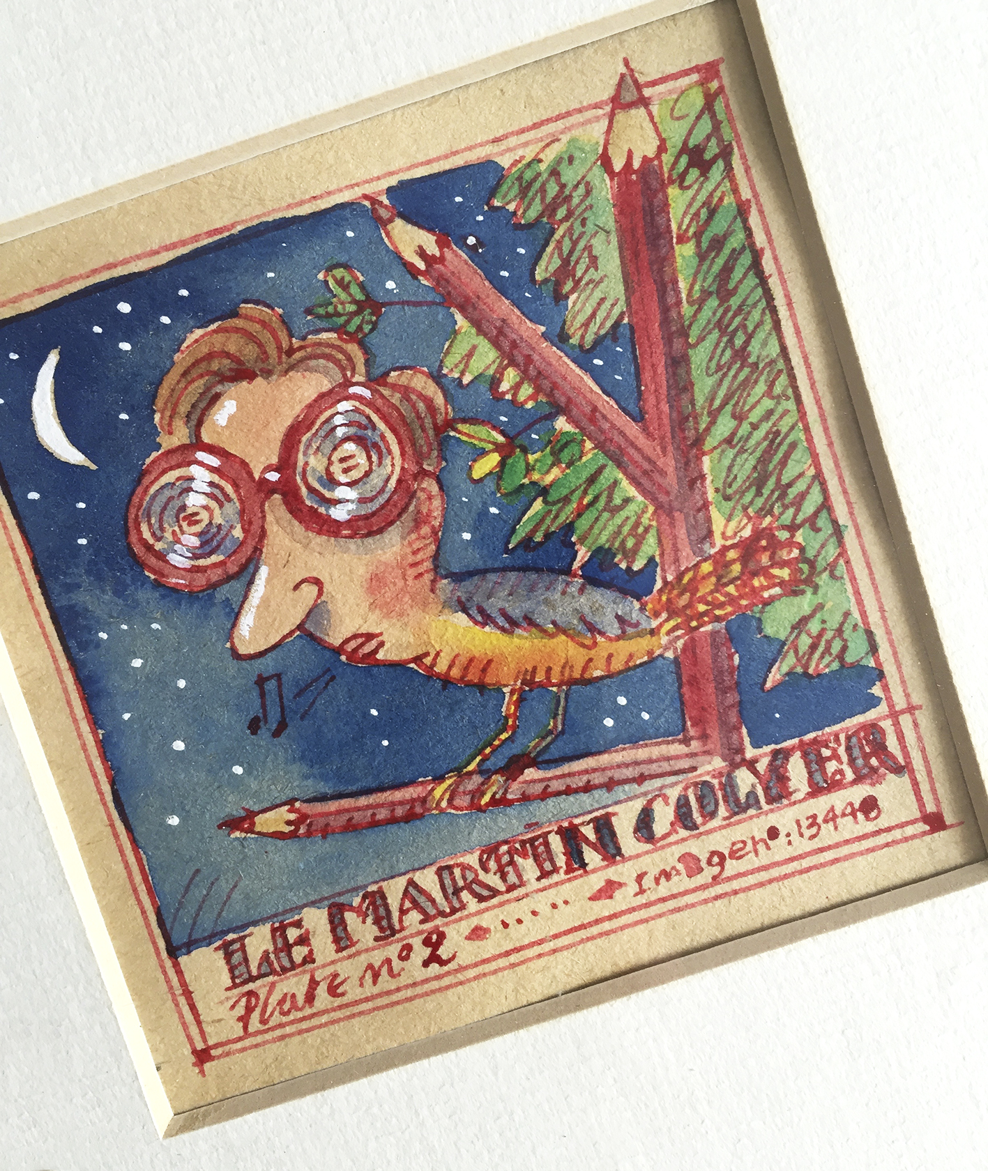
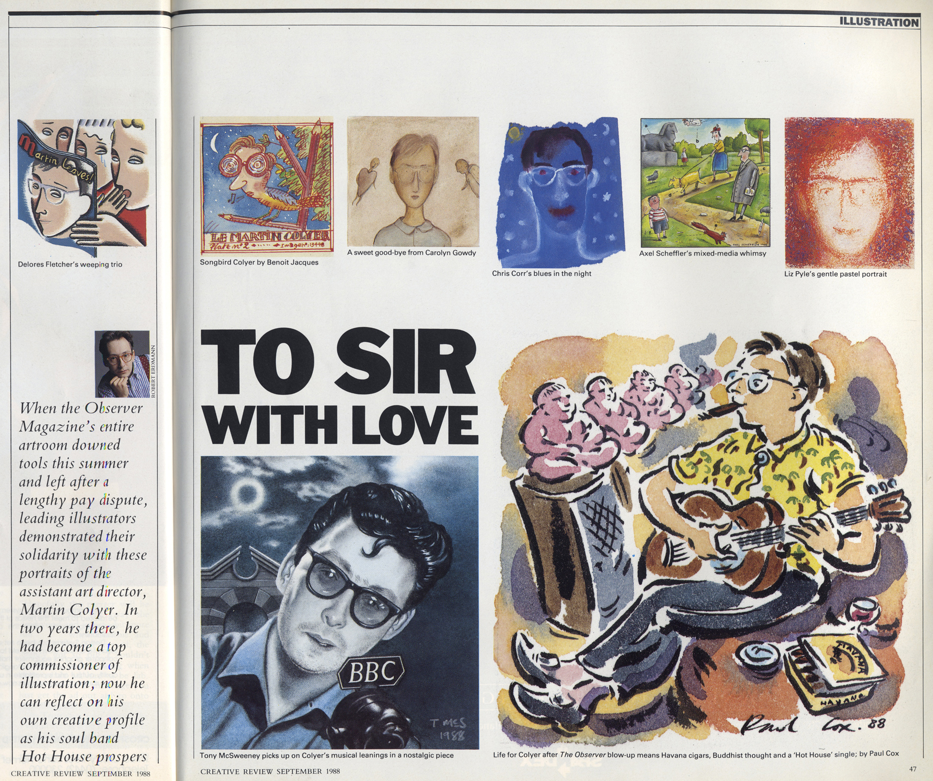
Around this time, something happened that was like a gift from the gods. I don’t know how I heard, but Paul had an exhibition of his work for advertising agencies at a gallery near our office on Marylebone High Street. I remember being astonished by his facility, his ability to pastiche, and paint beautifully across a remarkable range of subjects. I asked him to meet up for coffee, and he brought his sketchbooks with him.
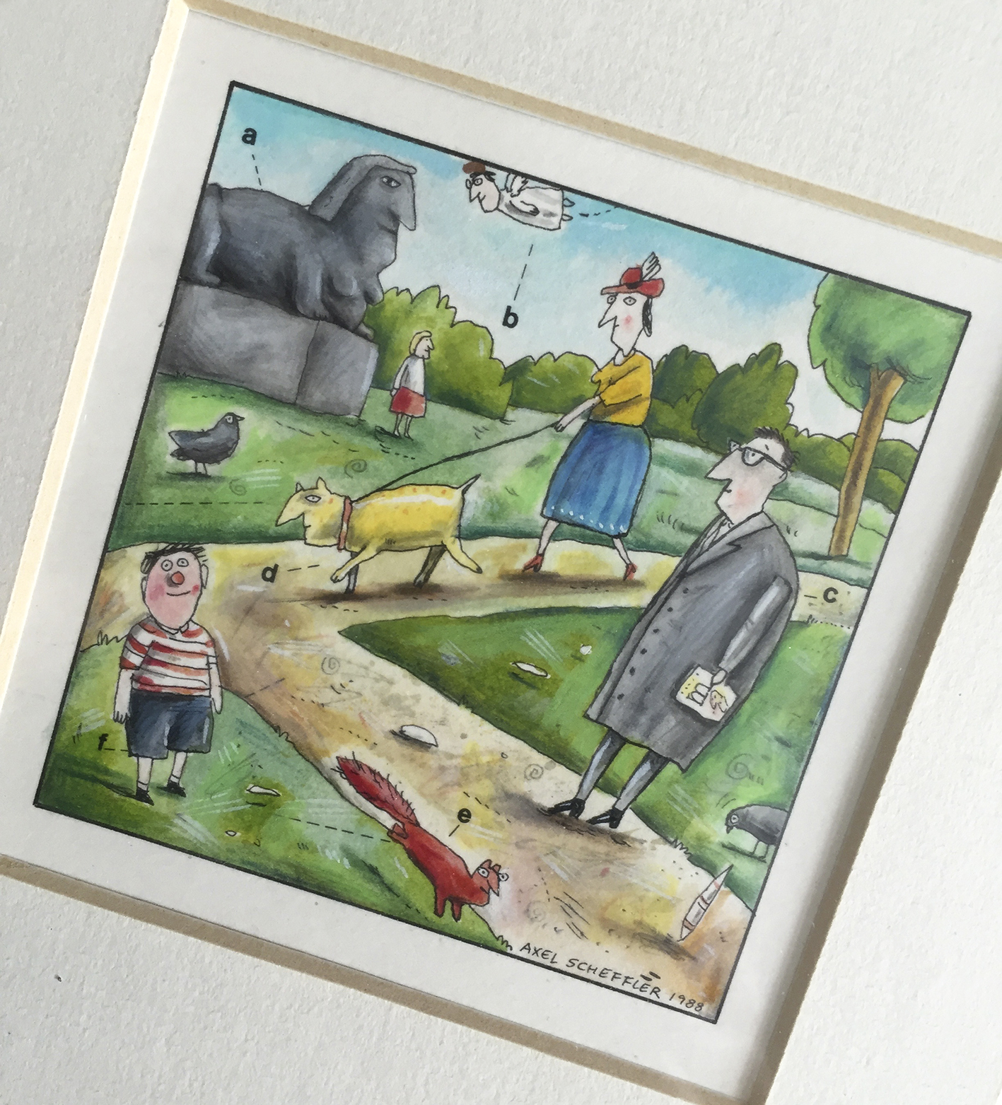
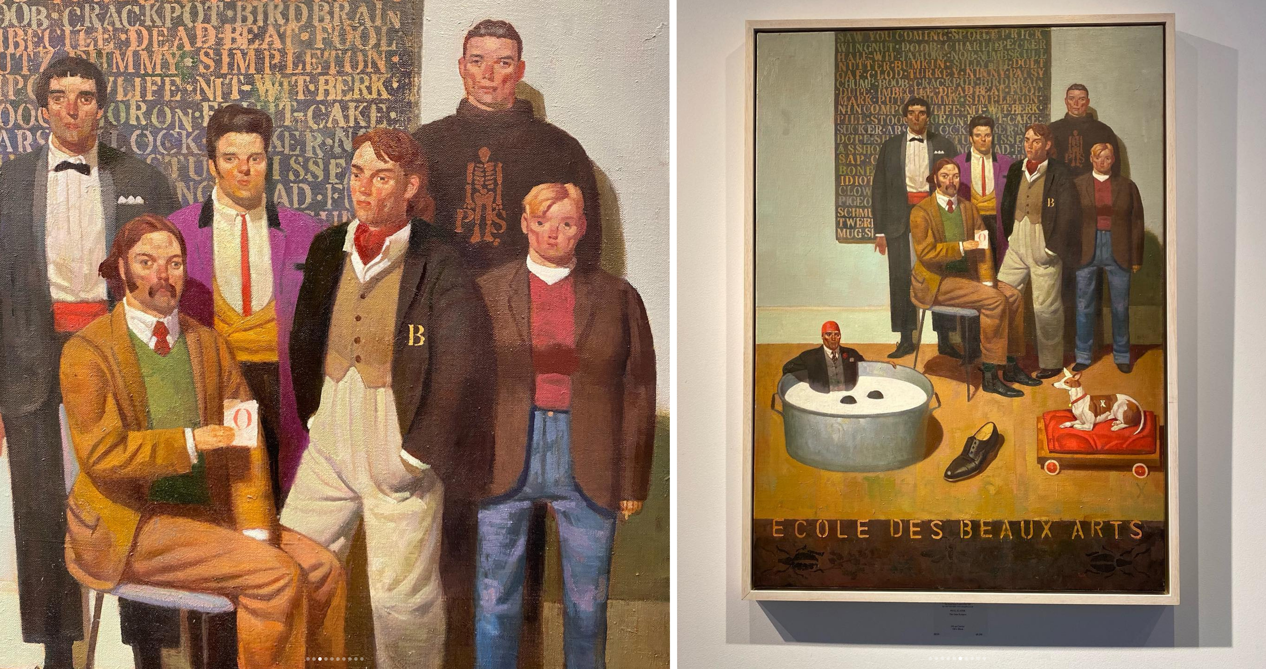
Words fail to express what I thought when I saw them — the exhibition works were clever and beautifully executed, but this was something else. I had been introduced to the World of Paul, somewhere it was always sort-of-1914, where babies drove tanks, where the ordinariness of suburbia contained bristling threats, and where the scale of life had been upended and giant and unlikely structures would hover in the air above beautiful landscapes. Quintessentially English, very funny, and absolutely unique.
From the moment I saw those sketchbooks, he became an important part of The Listener, Editor Russell Twisk being as enamoured as I was. Paul quickly became our go-to illustrator. Having Paul on board gave me the confidence to build a stable of cover artists: Bill Sanderson, Lynda Gray, Mick Brownfield, Ashley Potter, Anne Howeson, Peter Knock and Chris Corr, among others. These artists could work fast and come up with strong ideas.

My favourite moment of any Slater commission was the wry chuckle when he alighted on an idea as you were explaining the story. “What if it was, you know, a classic illustrated scene from Hamlet, but with an, heh, accountant standing there that he was afraid of?” This was for an article about Arts funding. Only five minutes before, it had seemed a knotty and visually unsolvable problem. I don’t remember ever giving Paul “notes.” I knew better than to get in the way of his imagination or try to change anything. He was just the best.


When Simon Esterson asked me to help design the Times Saturday Magazine, we paired Paul with Jonathan Meades, the restaurant reviewer. Their partnership became one of the longest-running collaborations between an illustrator and a writer in British newspapers. Whichever magazine I worked on would soon feature Paul’s artwork, and it was always a pleasure to commission him. His work appeared all over Britain’s media landscape, and the quality of his work was never less than exquisite. He painted continuously, selling his work to many famous names in the art world, working on magazine and advertising commissions as they came.
I last saw Paul at his exhibition at The Catto Gallery in Highgate a few years ago. He was unchanged from the first day I met him — humble, always deflecting any praise that came his way, a wry smile playing on his lips. The work was, as always, magnificent. The elegant surrealism and puzzling combos, featuring, as the catalogue said, “acrobatic cowboys, grim-faced couples in metal underwear, men wearing tiny trilbys and daleks in drawing rooms”, all underpinned with an awesome yet natural technique… everything that I loved since that day in the early 80s when I first saw his sketchbooks was on the walls in industrial-sized spades.
I was so pleased to shake his and his wife Sophie’s hands. I hope that Paul’s heaven has cowboys riding buffaloes, giant footballs, fried eggs in brine, and First World War privates, battling against the lunacy of war. Rest in Peace, Paul.
You can download the catalogue from the Catto show here:
There’s a great book, Fried Eggs in Brine, published by Atlantic Press in 2005, which has a brilliant afterword by esteemed illustrator and educator Robert Mason, who was at Maidstone College of Art with Paul. Paul also features in Artists of Radio Times by Martin Baker, and Radio Times Cover Story by Shem Law and Joe Moran