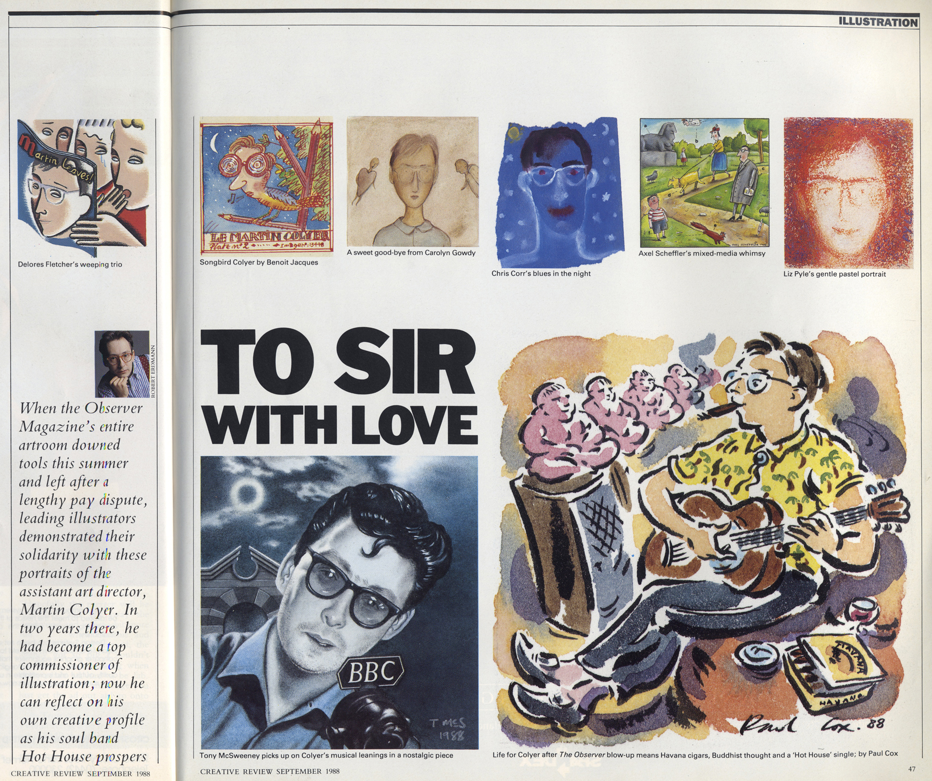
Illustration

Twelve (5): The Observer, 1988: Paul Cox

Qs

Paul Cox

Paul Cox

1 Having left the RCA six years previously, I had become reasonably established as an Illustrator, mainly working in editorial for newspapers and magazines and for several book publishers. It was the year following my marriage and the year before moving out of London to Norfolk.

2 I came through some very intensive and disciplined drawing teaching at Camberwell, where the involvement in printmaking and producing one’s own books using litho and letterpress gave you a good grounding in the craft. Illustration was an option within the Graphics department, which also ran printmaking, so there was plenty of opportunities to explore those mediums. The college had a very dominant Fine Art department, so the drawing discipline permeated extensively throughout the college, though we in Graphics were regarded as the lowest of the low, having sold out our integrity as ‘real artists’. Illustration was the only department where drawing was regarded as an end in itself, whereas in Fine Art, it was always seen as the means to the ‘great work’.

I did a three year MA at the RCA with Quentin Blake as professor and Peter Brookes as my personal tutor. Though being a more professionally aligned course, there wasn’t a lot of teaching, and you felt you had to find your own way. Linda Kitson had introduced me to reportage drawing, and I spent a lot of time working outside all around London. The annual Folio Society competition was the only time we actually grappled with any sequential illustration – that eventually led me to finding my own path into illustration and some of my first commissioned work.

3 I remember being very excited to see my work in print, particularly in the newspapers when I had only done the drawing the day before. There was a buzz in Fleet Street when the whole production was in-house from the Linotype setters in the basement to the editor’s office on the top floor. I felt fortunate to have emerged from college into what has become affectionately referred to as a golden age of illustration. There was so much commissioned work around from brochures to colour supplements, all with a rich variety of work you would see from week to week. It was a time when you could cut your teeth and learn on the job, however much time you spent at college; there was no way of preparing you for the real challenges of working to tight deadlines and demanding briefs. Even so, the printed pages were full of illustration, and you could recognise the unique styles of your peers straight away. We thought those days would never end.

By the end of the ’80s with the recession and the print moving out eastwards, marketing and cost efficiency seemed to have got the upper hand! I look back and see it as a time when art directors held more sway in how they commissioned, and with that more trust in us illustrators to deliver. It was at this time I began doing more work in the US, so our departure from London at the end of the 80s coincided with these changes. The arrival of the fax machine was an incredibly liberating tool as before we had to rely on constant dispatch riders taking sketches and artwork to and from clients; I didn’t miss the stress of all that. Sending faxes to clients in London and New York, sometimes cut into strips with instructions to piece them together at the other end, was an amazing revolution. You could be on the phone to a client discussing a drawing that only minutes before was being formed on your desk. The rudimentary fax has been way surpassed by the ease of transmitting images digitally now, but at the time this was an extraordinary and wonderful device!

4 I think that the editorial commitment to the use of illustrative elements has undoubtedly diminished. Whether this is due to a lack of confidence in the publications will to assert their unique identity, or just a lack of imagination or courage their part. It’s probably more due to the elevated powers of the marketing departments to tightly budget their productions, giving less scope for the art directors to be as adventurous. I think the role of illustration has shifted somewhat with more emphasis on sharper, graphic conceptual images, looking bright on the page though slightly ubiquitous and less personal when viewed overall.

Digitally generating images has changed the craft in such a way that has bypassed the hand made physical object of the artwork. It has allowed the image to be more pliable to suit the client’s needs and flexible in how the illustrator can be more adaptable. It has also become apparent how little drawing is now taught in the colleges at present; perhaps the digital revolution has enabled students to step beyond it. Learning how to interpret and reflect on the world around us through the honest accountability of drawing is such a true way of forming your identity as an artist and developing your own unique approach.

5 There have been many, though one of my earliest assignments was being sent to southern Spain by John Tennant for the Sunday Times Magazine. It was to illustrate Norman Lewis’s stories set in the late ’40s just north of Barcelona. I went for a week with £900 expenses (riches!), trying to cope with the Spanish Motorways in a little left-hand drive Seat, only having recently passed my driving test. The towns and people I drew had to reflect the period and the subject of the stories which were drawn on location. The challenge of location drawing is directing the elements you see around you into an image that reflects the experience of being in that place at that time. So it’s not just a record that a photograph will adequately capture. In this assignment, the degree of manipulation and adjustment to suit the stories taught me that you could incorporate imagined elements that were not present at the time, in this case making the images more relevant to Norman’s stories.

[Optional!] I was fortunate to have found my feet at that particular time in something in I love doing; the rest is stamina and hard work!

You can see how thoughtful Paul is from the insight of his answers. His inimitable style has never gone out of fashion, and he has worked extensively for most of the UK National press as well as having a long association with Vanity Fair in the USA. He was one of the founders of Blueprint, the A3 architecture and design magazine that started publishing in the ’80s. His work can be seen here.


Standard
Illustration

Twelve (1): On leaving The Observer, 1988

In 1988 I had just moved from Art Editing The Listener Magazine, a BBC publication with a strong tradition of using illustration as a means of dealing with often complex political and social subjects, to the Observer Magazine, the Sunday supplement of the Observer newspaper. I was Assistant Art Director, with responsibility for illustration. It was a new team at the magazine, put together by the AD, John Tennant. John had recently joined the magazine from being Michael Rand’s right-hand man at the Sunday Times Magazine, and he wanted to inject vitality and freshness to make it more than just an also-ran to the market-leader.

In the couple of years that followed we took a bold approach – we illustrated a whole feature on Ronald Reagan’s extraordinary “Star Wars” initiative, using Peter Brookes, Ian Pollock, Huntley / Muir and Jeff Fisher among others. We commissioned Brad Holland and Matt Groening (in his pre-Simpson days) and asked fashion illustrator Mats Gustafson to draw a portrait of Gore Vidal. We had fun.

We hit on the idea that our regular columns should be a showcase: Sue Arnold’s funny and spiky column (think Lucy Mangan or David Mitchell) would be illustrated by one artist in four-week slots – that would give 12 people throughout the year a month-long commission and a chance to have a themed set of work. For this slot, we used illustrators who were just getting established.

For our other weekly column, on wine, we decided that it would be great to use the talent emerging from art schools across Britain, giving 52 first-time job opportunities a year. We didn’t want to be prescriptive for either commission – we specified the finished size and left it at that. Of course, this resulted in some confusion. Still in art school-mode, some illustrators gave us four finished illustrations to choose from, as if it were a project with a crit at the end; artwork painted on bottles of wine; oil paintings that had to be reduced by 400%; collages of daunting complexity for the 50mm by 70mm space…

It was a fantastic time that came to an end when the entire art department resigned over the decision to back-date a pay cut for our freelance designers – they’d worked in good faith for an agreed fee. With the insouciance and arrogance of youth, we all figured we’d get another job without too much trouble. My colleague Shem Law (now Deputy Editor and Art Director of Radio Times) discreetly phoned a cross-section of the illustrators who had worked for us and asked them to paint portraits of me for a leaving card.

CR

The resulting work provided a glimpse into the world of illustration as it was at that time. Creative Review ran a selection of the drawings and carried the story [the references to music in some of the responses was because I had an alternative career going on at the same time…] While thinking of potential features for an issue of Varoom! on the theme of nostalgia, I thought of that leaving card and wondered what those involved could remember of that period in their lives, and how their careers had subsequently developed, so I tracked down their emails and asked if they’d answer a series of questions.

1) Where were you, professionally and personally, in 1988? [i.e. just starting out/just left college/established].

2) If you came through the art education system, what was your experience of the way illustration was taught? If you didn’t, how did you arrive as an illustrator in London in the late 80s?

3) What do you look back on fondly about that time in publishing?

4) Do you think the place of illustrators or cartoonists has changed in the intervening years?

5) Can you pick one favourite or important project from your 30-plus year career?

[Optional!] If I asked you to sum up your career in one sentence, could you?

Over the coming weeks, I’ll post what those who answered told me about life in London, publishing, and illustration in the long-gone days of ’88.

Standard
Interludes

Interlude: From The Coalface (1970s-2010s)

From Varoom! Magazine, Winter 2011-12

Late August last year saw a firestorm of debate on the merits of the Radio Times of today vs the Radio Times of the Golden Age of British Magazine Design (ironic italics mine). Mike Dempsey, graphic design grandee, had posted a critique of the current RT on his always thought-provoking blog Graphic Journey, and the magazine community fervently responded.

MIke’s point could be summed up as “Modern Magazines are rubbish—where are David Driver and Michael Rand when you need them?.” The response from those still at the coalface seemed to be: “Try doing a great magazine cover now with a bunch of marketing men breathing down your neck, a load of Celeb PRs playing up and a design team of one mac and a dog.”

As someone who straddles both periods I always have a problem with the “It was great back then” approach. It often cherry-picks to deliver its argument—there was some fantastically bad magazine design in the sixties and seventies. It usually doesn’t take into account the massive changes in the industry—way more pages now, allied to way less staff, and with a newsstand that no-one in the sixties could have imagined. And finally it always seems to subtly belittle the great work being done now.

I bow to no-one in my admiration for both David Driver and Michael Rand (especially as they taught me most of what I know). They presided over a period of fantastic illustration, beautifully rich and inventive photography and clever graphic concepts. The bold updating of illustrative styles from Eric Ravilious to Paul Slater and Ralph Steadman found a way to take a readership used to illustration to new places. But the world was different then. It was a world with four TV channels. There was no such thing as rolling news.

Look at rock music, for example, and tell me it’s as easy to be inventive now as it was in 1966. There’s always a ‘perfect storm’ time when the talent meets the market and the market says: Yes! Give me more. Give me more of that different, difficult and interesting stuff! It’s a heady time when mass taste coincides with aesthetic intent. That doesn’t mean that everything that follows is always inferior, but the shock of the new is always a powerful thing.

Photojournalism looked powerful and moving on a magazine front cover in 1968, when TV news was more circumspect (although my guess is that the designers of Life and Picture Post probably thought they’d been there and done that!). So it looks from here like bravery. But you can’t keep doing that forever. And you look to different places for that level of inventiveness. And it’s currently to be found at the fringes of this fractured industry, and mostly not in the mass market.

And the award-winning spreads and covers are never the whole story. Even the great magazines had mundane features behind the cracking Peter Brookes or Don McCullin cover. The sixties magazines technically weren’t a patch on, say, the Fortune magazine of the forties or fifties. Hot metal was dying, the craft was being lost, and no-one was sure what was coming. (What came, before the mac, was the much unloved phototypesetting.) So there were no computers, and all your precious typography was in the hands of a man in the bowels of Fleet Street or on an industrial estate at Park Royal who really didn’t care about your lovely attempts at better line breaks and interesting drop caps. I once asked for a cut-out of a man smoking a pipe in the days of hot metal, and when I dared to venture a suggestion that the blockmaker’s attempt fell a little short, and that it would be good if the pipe was attached to the man’s mouth rather than floating in thin air, being curtly asked, “Who d’you think I am? Fucking Rembrandt?”

It is true that the large mainstream magazines of today are commercially tuned and focus group driven, but if you look around even a mid-sized branch of WH Smith’s you’ll come across the inheritors of what’s possible in magazine design. It’s an understandable impulse to make the comparison of a single title then and now, but I’m not sure that it’s the right prism to view this subject through. Let’s just celebrate that great past, be glad that those people got to do that work. But accept that the challenges and the context are different today and celebrate what’s great now…  tell me that Andrew Diplock at Wired or Finnie Finn at I:Global Intellegence or Marissa Bourke at Elle aren’t doing terrific work, too.

Standard
Illustration

Three: Geof Kern

Two meetings
Meeting One: I met America’s leading rock n roll memorabilia dealer, Jeff Gold, at a hotel on Jermyn Street in 2009, with a copy of a book autographed by Big Bill Broonzy. I was clearing out my dad’s stuff and I knew Jeff was coming to London on a buying expedition. I was looking at his website www.recordmecca.com and noticed that he had art directed Days Of Open Hand by Suzanne Vega. I’m pretty sure that this was one of Geof’s pieces that I’d seen that inspired me to ask him to do the covers for a Mozart partwork that I had been hired to design for the Sunday Times Magazine. Jeff was charming, confirmed that he had indeed art directed Geof, had even won won a Grammy for it, and bought the Broonzy book for exactly the amount I needed to buy a Theramin.

I’d first seen Geof’s work on the covers of Beach Culture and, I think, Wet, out of Los Angeles, a time when really interesting magazine were emerging from of the surfing scene in California. These were among the first magazines designed by the always-interesting David Carson.

I tracked down Geof’s phone number in Dallas, Texas—don’t remember how—and hired him transatlantically (not so easy in those days of fax machines and unreliable airmail). To convince Michael Rand I roughed out a cover (quite badly) using bits and pieces from all over the place, some from Geof’s work itself. Thrillingly, Geof agreed to do the job (I’m pretty sure that I never sent him my rough, though) and here’s some of the correspondence and notes.

The interesting thing looking back is that each fax has a slightly desperate note of “I’ll be at Frozen Tundra 739 456 from 2 until 4” pace the Tony Roberts character in Woody Allen’s Play It Again, Sam. How simple it seems now…

“This fax is for:  M A R T I N C O L Y E R
from Geof Kern, Dallas

—————-

Well I am writing to you on Tuesday afternoon and I guess
it is now Wednesday morning as you read this (ever get tired
of this kind of fascination?)

I hope you like these ideas because it took me until the last
minute to work on them, and because of that, we are starting
the production now.

Assuming then, that their basic content is acceptable, I have
a few more questions:

On the illustration for music are there specific operas or
other works you would like me to write on the “name wheel?”

Same question for any specific works written in the illustration
for “Festival.”

And on the illustration for “The Man,” do I have to necessarily
depict Salzburg — or is Vienna OK?

Under the current conditions and the nature of these ideas, I
feel it would be best if I did this series in black and white.

Please call if you have a chance today

Geof”

Of course, black and white covers were not what anyone was expecting, but Geof had started. I had no issue—always loved a cool monochrome—but having seen the stupid rough everyone senior to me expected it would cleave to that template. Michael even said he preferred the rough. No! Lesson learned—never show anyone a comp that boxes you into a corner. I hit upon the idea of selling it as a sophisticated duotone, and dug out some printer specs for green, purple and blue duotones. I was helped in forcing it through by our approaching print deadlines, and in the end everyone was pretty happy with the whole thing. I really enjoyed my short time at The Sunday Times Magazine—such a lot of talented people there. Hannah Charlton was the Editor on this part work.

Meeting Two: At the British Society of Magazine Editors Awards recently I ran into Tony Chambers, a designer I’d always admired, who was at the Sunday Times Magazine in the late 80s at the time I was doing some projects for them. Out of the blue, Tony started talking about the Mozart partwork, saying “I loved those Geof Kern covers. I kept those!” I professed disbelief. Tony insisted. We went for a drink with the lovely Wallpaper* crew. Tony reiterated that he had the copies, and that they were displayed at home on a bookshelf. I ordered a White Russian (a mistake, which everyone unaccountably compounded by saying That’s a good idea! It wasn’t) whilst still expressing doubts that Tony a) had them, and b) knew where to find them.

Hungover, the next morning this arrived in my inbox:

“I didn’t lie.
First picture is exactly as found this morning. Second is styled up – showing all four covers. I have three copies of each! They look even better than I remembered. Good back page too.”

Epigones—with Tony Chambers of Wallpaper*

Geof is amazing: his work continued to get weirder and even more wonderful. More at his website:

www.geofkern.com

Standard