Two meetings
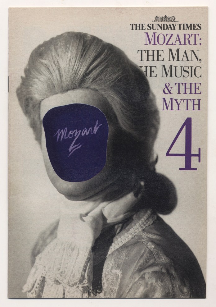
Meeting One: I met America’s leading rock n roll memorabilia dealer, Jeff Gold, at a hotel on Jermyn Street in 2009, with a copy of a book autographed by Big Bill Broonzy. I was clearing out my dad’s stu ff and I knew Jeff was coming to London on a buying expedition. I was looking at his website www.recordmecca.com and noticed that he had art directed Days Of Open Hand by Suzanne Vega. I’m pretty sure that this was one of Geof’s pieces that I’d seen that inspired me to ask him to do the covers for a Mozart partwork that I had been hired to design for the Sunday Times Magazine. Jeff was charming, confirmed that he had indeed art directed Geof, had even won won a Grammy for it, and bought the Broonzy book for exactly the amount I needed to buy a Theramin.
I’d first seen Geo f’s work on the covers of Beach Culture and, I think, Wet, out of Los Angeles, a time when really interesting magazine were emerging from of the surfing scene in California. These were among the first magazines designed by the always-interesting David Carson.
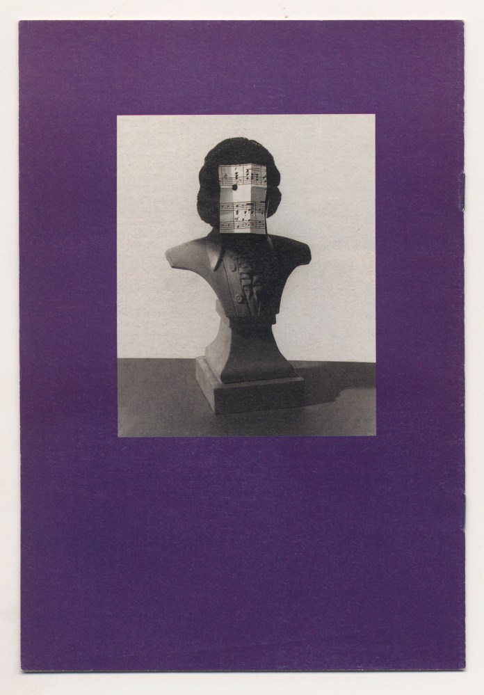
I tracked down Geof’s phone number in Dallas, Texas—don’t remember how—and hired him transatlantically (not so easy in those days of fax machines and unreliable airmail). To convince Michael Rand I roughed out a cover (quite badly) using bits and pieces from all over the place, some from Geof’s work itself. Thrillingly, Geof  agreed to do the job (I’m pretty sure that I never sent him my rough, though) and here’s some of the correspondence and notes.
The interesting thing looking back is that each fax has a slightly desperate note of “I’ll be at Frozen Tundra 739 456 from 2 until 4” pace the Tony Roberts character in Woody Allen’s Play It Again, Sam. How simple it seems now…
“This fax is for: M A R T I N C O L Y E R
from Geof Kern, Dallas
—————-
Well I am writing to you on Tuesday afternoon and I guess
it is now Wednesday morning as you read this (ever get tired
of this kind of fascination?)
I hope you like these ideas because it took me until the last
minute to work on them, and because of that, we are starting
the production now.
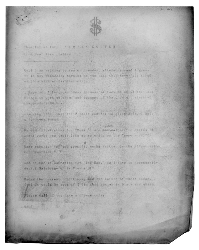 Assuming then, that their basic content is acceptable, I have
a few more questions:
On the illustration for music are there specific operas or
other works you would like me to write on the “name wheel?”
Same question for any specific works written in the illustration
for “Festival.”
And on the illustration for “The Man,” do I have to necessarily
depict Salzburg — or is Vienna OK?
Under the current conditions and the nature of these ideas, I
feel it would be best if I did this series in black and white.
Please call if you have a chance today
Geof”
Of course, black and white covers were not what anyone was expecting, but Geof had started. I had no issue—always loved a cool monochrome—but having seen the stupid rough everyone senior to me expected it would cleave to that template. Michael even said he preferred the rough. No! Lesson learned—never show anyone a comp that boxes you into a corner. I hit upon the idea of selling it as a sophisticated duotone, and dug out some printer specs for green, purple and blue duotones. I was helped in forcing it through by our approaching print deadlines, and in the end everyone was pretty happy with the whole thing. I really enjoyed my short time at The Sunday Times Magazine—such a lot of talented people there. Hannah Charlton was the Editor on this part work.
Meeting Two: At the British Society of Magazine Editors Awards recently I ran into Tony Chambers, a designer I’d always admired, who was at the Sunday Times Magazine in the late 80s at the time I was doing some projects for them. Out of the blue, Tony started talking about the Mozart partwork, saying “I loved those Geof Kern covers. I kept those!” I professed disbelief. Tony insisted. We went for a drink with the lovely Wallpaper* crew. Tony reiterated that he had the copies, and that they were displayed at home on a bookshelf. I ordered a White Russian (a mistake, which everyone unaccountably compounded by saying That’s a good idea! It wasn’t) whilst still expressing doubts that Tony a) had them, and b) knew where to find them.
Hungover, the next morning this arrived in my inbox:


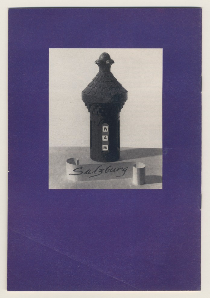

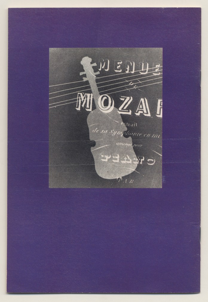

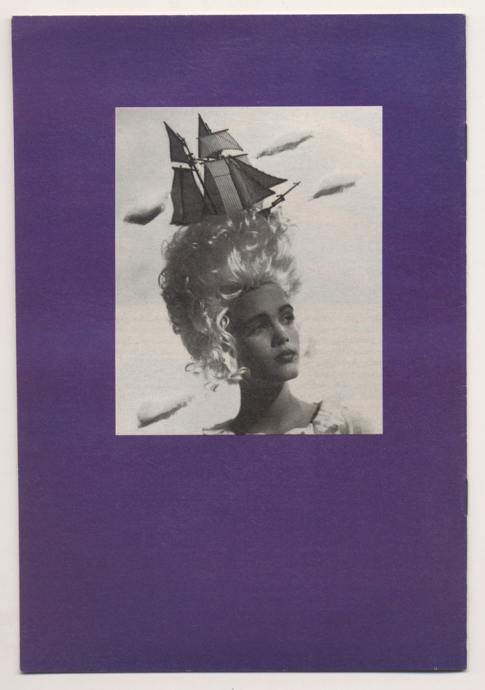

They were really great covers, Martin. I still have a set of the magazines…Uh-oh, hang on, I think they went in the last move. Ah well, it will add to their rarity value. It was fun working on the project.
Indeed it was, Roger. See you next time you’re in Edgware Road!
What a great surprise to find this article. Those were creative days! Mind if Friend + Johnson links this to their blog? It’s a fascinating look at the past!
Oh, sure Cristina, happily. Geof’s a genius. Give him my fondest regards. Best, Martin
Thanks! Here is the link http://friendandjohnson.com/blog/those-were-the-creative-collaborative-years. Links back to this post, as I could never make your wonderful writing justice.
Best, Cristina