

You can download the catalogue from the Catto show here:


You can download the catalogue from the Catto show here:
The final three illustrators I either couldn’t trace or didn’t respond to the Q&A. But here are their illustrations; left to right, Mathilda Harrison, Tony McSweeney and Steve Way.

I found all of the responses interesting and illuminating, and a pretty good portrait of that time in design and illustration. And I want to stress that it was very much a team effort by all – John Tennant, Shem Law, Dave Ashmore, Cath Caldwell, Marcel Ashby and Alan Ashby. John was an inspirational, enthusiastic leader, and tremendously exciting to work for. And great thanks to all the talented illustrators who took part, remembering their earlier selves from thirty years previously.

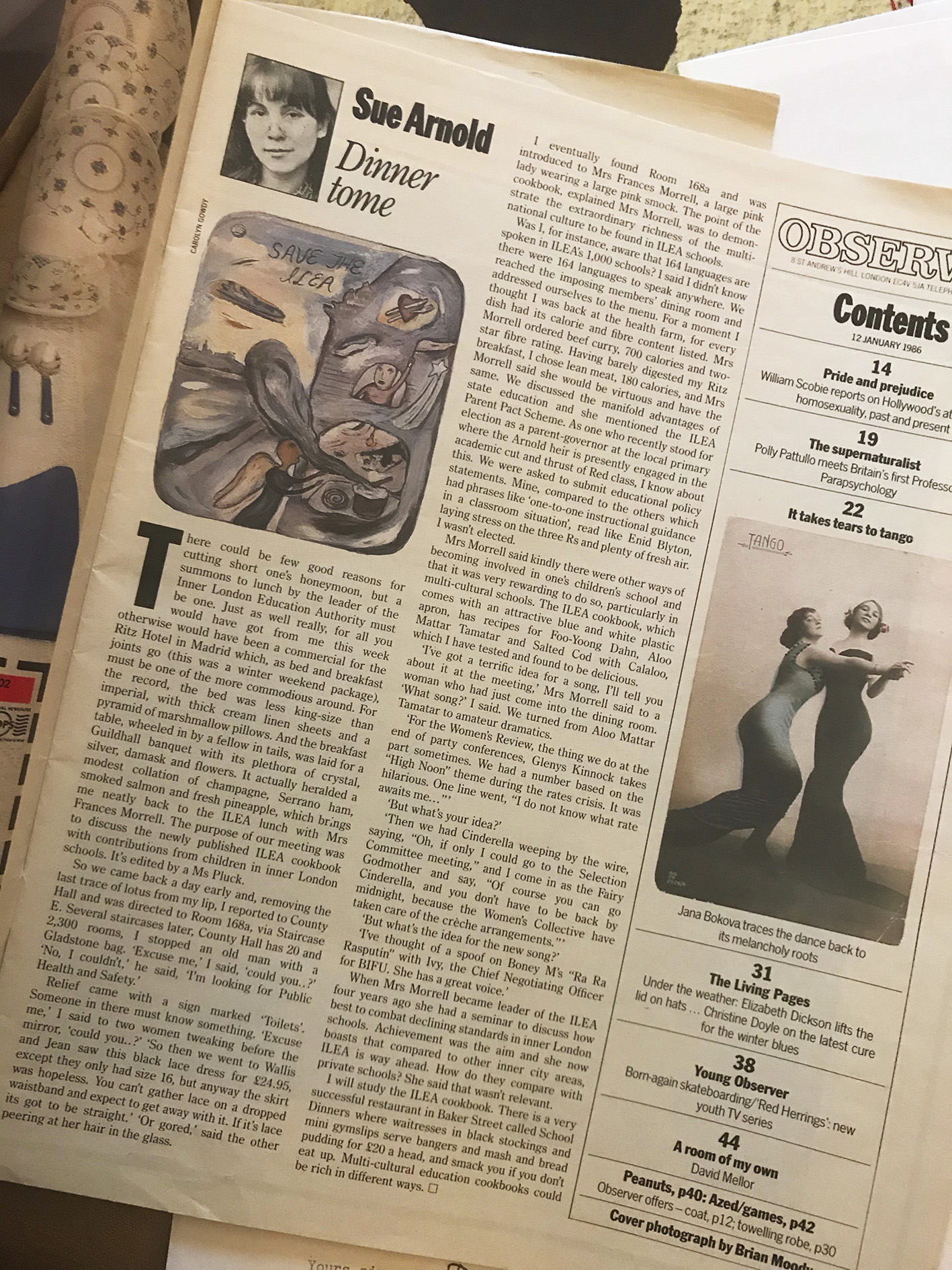
Lastly, here’s something I found the other day, The Observer Magazine from 12 January, 1986, just as we were starting on the project of revamping it. Carolyn Gowdy illustrating Sue Arnold.


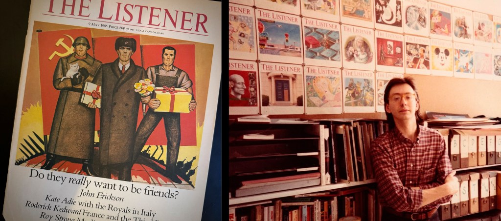
1 Thirty years ago…! Jill and I were living in her lovely converted Victorian end of terrace shop near Highbury Fields, Islington. We were both 41 and had been together for close to ten years. Our children were 15, 6 and four years old. I was busy and earning a reasonable living. My work was appearing in many publications, helped by the exposure given to it by a very nice and brilliant art director called Martin Colyer that I had accosted at The Listener and then The Observer magazine. (I’m looking right now at a brief of February 1988 to produce a map and a series of drawings for an internal brochure on the occasion of the move to the Marco Polo building). We were able that Christmas to take our family for a memorable first visit to Chile.
2 I had studied three years of architecture in Chile but left college to work as an illustrator, something I had been training myself to do since childhood. After meeting Jill on my first trip to Europe in 1978, I decided to re-start in the UK and soon I was walking the streets of London with blind, foolish, bullet-proof confidence and a growing portfolio, slowly getting to be well-known.
3 The energy, the innocence and trust common to all of us then young artists, the friendly and enthusiastic reception from people like you, the excitement of seeing one’s work in print and the incredulity at making a living with it.
4 Requirements are still varied and have expanded. The need for expressive images in all fields of graphics is undiminished. Even with the development of computers in between, now as then, media needs talented people who can graphically synthesise texts, issues and ideas. Oscillating between retrograde to enquiring fashions change, but it’s still as much of a challenge to produce such kind of work with electronic tools as it is with more traditional media. As always, the artists – illustrators and designers – are the ones who make things boring or exciting.
5 It has to be two. Editorially, the years-worth of weekly commissions for Simon Hoggart’s column in The Observer colour magazine. Sustained projects give one a chance to know what kind of artist you can be. Even though BIG BABY, a picture book published by Walker’s with my drawings sank without a trace, as children’s book illustrator it was going to be hard to match the excitement of a first published collaboration.
[Optional!] These days of painful cold turkey make me realise I’ve been a commission junkie all my life. Anything pressing on the go?
Claudio was always such fun to work with, and one of those people who were just a pleasure to be around. See some work here, and read a profile on page 24 of the May issue of Bridport Times here.
1 In 1988 it still felt like early days in my illustration career. I’d graduated from the RCA, and I was teaching drawing a day a week at St Martin’s and in my own work I was experimenting with different ways to work, using collage, very basic printmaking. Illustration was going through a golden age, really flourishing, lots of illustration everywhere, packaging and glossy reports, and lots of visual experimentation from lots of people.
2 Illustration at the RCA was very drawing-based, both in the studio and on location. For me, it was the best way to develop my work. I’ve always been passionate about drawing, and it has always been a central part of my work, it’s so fundamental, so vital.
3 The late 80s was such a creative time for illustration and illustration was so widely used at the time. I remember walking around a supermarket and being astonished by the beautifully illustrated teas, coffee, wine labels, biscuit packets. It was everywhere.
4 I think there has been a shift in image making since the 80s; digital work has made a huge change and drawing has lost some of its importance. I think it will make a return just as the ‘crafts’ are reappearing, knitting, weaving, linocutting as a reaction to our digital world.
5 In the 80s, I began travelling and drawing around the world, and it was thrilling & fascinating. I’m still curious and eager to see and show more of the world I see. I worked with Qantas for about 18 months and travelled a lot in Asia and the Pacific. It was such a good education! I want to see more and draw more and show people what I see.
Chris’ work has never lost its sense of zing and pleasure, and we worked together at most of my magazine jobs. You can find a selection of his ever-vibrant work here.
From Varoom, Autumn 2011
I’m not an expert, but I’ve been a lover of cartoons for years; Ray Lowry’s matchless work for the NME, Gahan Wilson and Charles Addams’ worlds of strangeness in the New Yorker, deranged Honeysetts in Private Eye, the art in Roland Topor’s fluid line. Casting an eye around I found the modern cartoon where you’d expect (the cover of the New Yorker) and where you wouldn’t (the V&A). I found them in a friend’s sketchbook and in the national press. As I looked around at the cartoons that I liked most at the moment I was struck by the fact that, whatever else, cartoons are still, even in the digital age, all about the drawing. All about the scratch of the pen, the feel of the line, the sketch in service of the words, or the sketching making words superfluous…
John Cuneo, Illustrator, New Yorker Cover, June 27 2011
So, Drum Roll! Top Of The Heap! The New Yorker cover! Is this the Holy Grail job? Maybe not any more – maybe it isn’t seen as cutting edge enough (also it’s blurrily on the border of art versus illustration) but… it is the most visible cartoon job in the world. and I like a drawer with a worldview, and John Cuneo has one, like all of the greats.
BRIEF I will occasionally send Francoise Mouly, NY’s art director, rough sketches for potential cover ideas, the vast majority of which are summarily dismissed.
MATERIALS Ink and watercolor on paper.
RESEARCH I combed through a couple of dog magazines for breeds that might lend themselves to a bit of anthropomorphising, and worked backwards, to the dog owners, from there. Also found a little downtown (NY) street reference.
PROCESS Was asked to work up a colour comp first, and then a final. And then another version, one with more of a “summer” wardrobe and feel to it. Each effort getting progressively tighter of course, and incrementally less funny.
DISTRACTIONS After the art gets accepted and publication is pending, one selfishly hopes for an uneventful news week—so that a cover-worthy current event doesn’t rear up and usurp your little dog gag.
NUMBERS 5. The number of Irish Water Spaniel owners who sent me pictures of their pets.
WEBSITE http://www.johncuneo.com
Steve Way, Cartoonist & Cartoon Editor, Personal Notebooks
You might call Steve Way’s visual journal The Loneliness Of The Long Distance Cartoonist. Follow our hero, Steve, as he maps out his daily rounds – of cartooning/ living/organising builders/cooking food/attending glittering fashion shows – and commutes between London and Moscow in an attempt to spend time with his partner Fiona, Art Director of Vogue Russia. In the tradition of Art Spiegelman, an everyday relationship is explored in extraordinary detail and Steve gets to use up Moscow’s supply of Indian ink.
BRIEF Self-imposed, but girlfriend said it first – “You are a lot funnier in real life than you are in your cartoons”. Also real life is a lot more interesting, with her working in Moscow, than another UK joke about the recession. The fact that the gag is drawn on a heavy Stalinesque table in an ex-Soviet 1958 apartment (on my visits) is the wry bit. The diary structure, sticking to what happened on that day only, hopefully keeps the whiny graphic novel tone at bay.
MATERIALS Dip pens bleed too much, pencil’s too faint and doesn’t look permanent, so initially black felt tips (Edding 55, Mitsubishi Uniballs, anything 0.5.) However, the line was a bit continuous and not good at showing the foul winter Moscow throws at you. So now it’s fine black biros you can hatch with, that give a slightly broken line when you draw fast, plus clog romantically when they are about to run out. It looks like ‘real’ drawing.
RESEARCH Remembering. Busy days are the worst – cue hunting for scraps of paper I’ve written one- word tags of the day’s events on. All drawings are from memory, the exception being the covers of books/mags read. I try to get the type sort-of-right by having them in front of me.
PROCESS Always behind, so there are bursts of catch up, often 3-week clumps. It takes about 3/4 hour per page. There are no roughs, I just start. Some days I draw badly and improve, others the reverse. In fact a really good passage of drawing slows you down, as the page opposite has to have the same care. My spelling is always a random process. The record for pages in a day is 15. A scary amount of drawing.
DISTRACTIONS Very occasionally people commission me when I’m so in the mood to do the diary, tut. It is its own distraction, you can’t even draw or catch up when travelling, particularly on planes. People get interested in it and want to talk, or in the recent case of Callum (aged 4) want you to “do sharks.”
NUMBERS One page, One day, one A5 Paperchase—pink, so I can find it—diary. Ruled lines on each cream page, all ignored. Sadly a lot less British Midland air miles to Moscow than you’d think, so still not able to draw the First Class lounge. You can’t cheat.
WEBSITE http://www.stevewaycartoons.com
Tom Gauld, Illustrator/Cartoonist/Artist/Merchandiser/PR/Author
The modern world of the image demands that he straddles all of these nomenclatures. His recent Guardian cartoons are also, I would suggest, poetry.
BRIEF Every week I make a cartoon for the letters page of the Saturday Guardian Review. The image has to relate to one of the letters on the page, but I try and make something which works without reading the letter. This week The Guardian sent me a letter about a book reviewed the previous week. Two phrases interested me: “awash with spies immediately before the Norfolk Zeppelin raid of January 1915” and “nocturnal goings on in the saltmarshes around Hunstanton.”
MATERIALS Uniball pen and correction fluid on paper, then Photoshop.
RESEARCH None.
PROCESS I begin all my projects doodling in my sketchbook. These are the doodles for Nocturnal Goings On In The Saltmarshes (Mr Victorian Novel was for the following week’s cartoon). Once I have an idea, I will draw a pencil-version, which I scan into Photoshop and fiddle with. When I’m happy, I print it out and make the final ink drawing by tracing on a lightbox. This gets scanned back in, tidied up and coloured. I’m very lucky that Roger Browning, the art director on this, trusts me enough that I don’t have to do a rough. I just make a cartoon and they print it, which I find very liberating. Though they did once ask me remove the word “Wanker”.
DISTRACTIONS Turnaround is quite tight: I get the letter on Tuesday afternoon and hand in the final art on Wednesday morning, so I’m quite focused.
NUMBERS This was my 254th weekly cartoon for The Guardian Review. To see the completed Nocturnals cartoon go to http://www.varoomlab.com.
WEBSITE http://www.tomgauld.com
Q&As by John O’Reilly
Two meetings
Meeting One: I met America’s leading rock n roll memorabilia dealer, Jeff Gold, at a hotel on Jermyn Street in 2009, with a copy of a book autographed by Big Bill Broonzy. I was clearing out my dad’s stu ff and I knew Jeff was coming to London on a buying expedition. I was looking at his website www.recordmecca.com and noticed that he had art directed Days Of Open Hand by Suzanne Vega. I’m pretty sure that this was one of Geof’s pieces that I’d seen that inspired me to ask him to do the covers for a Mozart partwork that I had been hired to design for the Sunday Times Magazine. Jeff was charming, confirmed that he had indeed art directed Geof, had even won won a Grammy for it, and bought the Broonzy book for exactly the amount I needed to buy a Theramin.
I’d first seen Geo f’s work on the covers of Beach Culture and, I think, Wet, out of Los Angeles, a time when really interesting magazine were emerging from of the surfing scene in California. These were among the first magazines designed by the always-interesting David Carson.
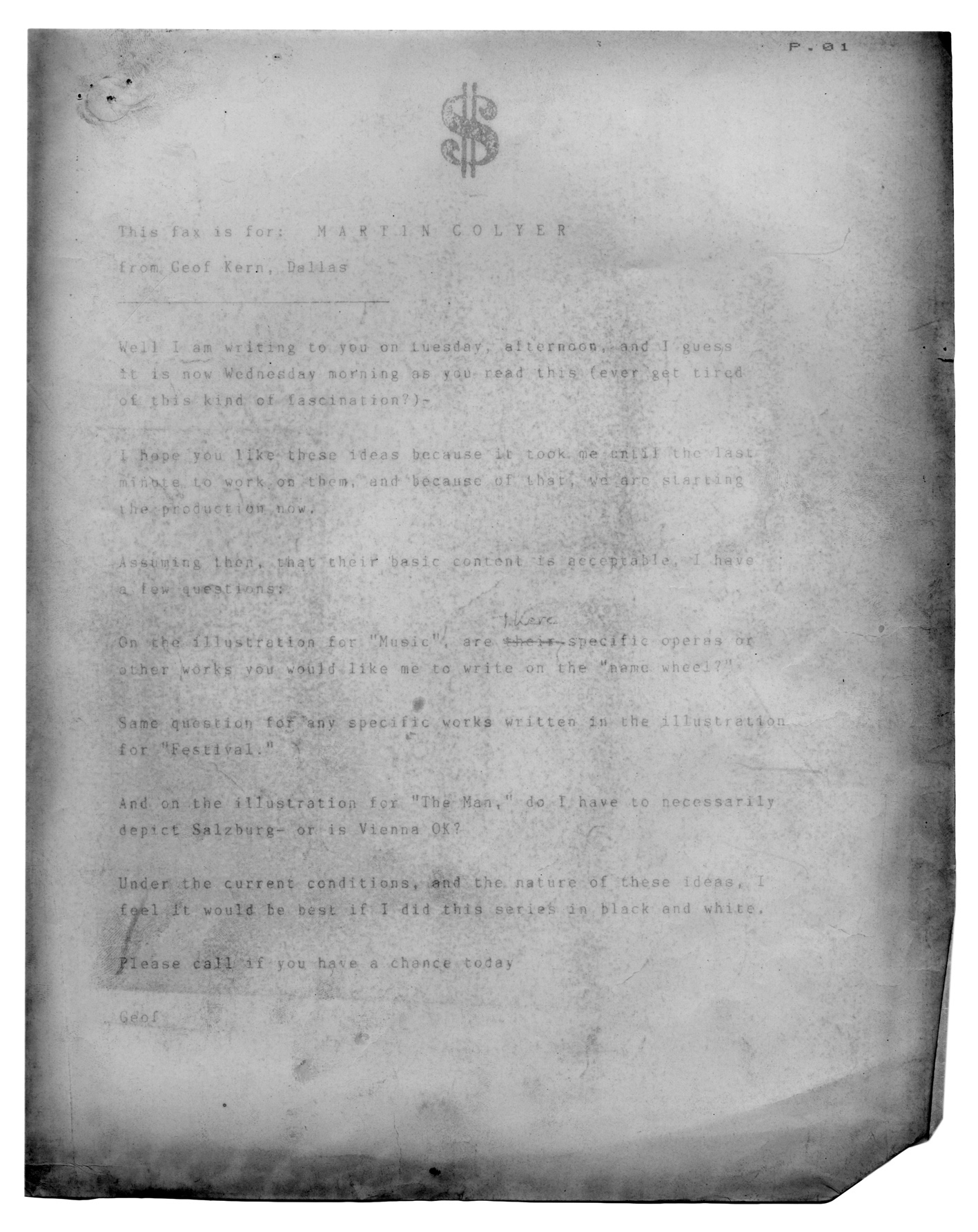
I tracked down Geof’s phone number in Dallas, Texas—don’t remember how—and hired him transatlantically (not so easy in those days of fax machines and unreliable airmail). To convince Michael Rand I roughed out a cover (quite badly) using bits and pieces from all over the place, some from Geof’s work itself. Thrillingly, Geof  agreed to do the job (I’m pretty sure that I never sent him my rough, though) and here’s some of the correspondence and notes.
The interesting thing looking back is that each fax has a slightly desperate note of “I’ll be at Frozen Tundra 739 456 from 2 until 4” pace the Tony Roberts character in Woody Allen’s Play It Again, Sam. How simple it seems now…
“This fax is for: M A R T I N C O L Y E R
from Geof Kern, Dallas
—————-
Well I am writing to you on Tuesday afternoon and I guess
it is now Wednesday morning as you read this (ever get tired
of this kind of fascination?)
I hope you like these ideas because it took me until the last
minute to work on them, and because of that, we are starting
the production now.
 Assuming then, that their basic content is acceptable, I have
a few more questions:
On the illustration for music are there specific operas or
other works you would like me to write on the “name wheel?”
Same question for any specific works written in the illustration
for “Festival.”
And on the illustration for “The Man,” do I have to necessarily
depict Salzburg — or is Vienna OK?
Under the current conditions and the nature of these ideas, I
feel it would be best if I did this series in black and white.
Please call if you have a chance today
Geof”
Of course, black and white covers were not what anyone was expecting, but Geof had started. I had no issue—always loved a cool monochrome—but having seen the stupid rough everyone senior to me expected it would cleave to that template. Michael even said he preferred the rough. No! Lesson learned—never show anyone a comp that boxes you into a corner. I hit upon the idea of selling it as a sophisticated duotone, and dug out some printer specs for green, purple and blue duotones. I was helped in forcing it through by our approaching print deadlines, and in the end everyone was pretty happy with the whole thing. I really enjoyed my short time at The Sunday Times Magazine—such a lot of talented people there. Hannah Charlton was the Editor on this part work.
Meeting Two: At the British Society of Magazine Editors Awards recently I ran into Tony Chambers, a designer I’d always admired, who was at the Sunday Times Magazine in the late 80s at the time I was doing some projects for them. Out of the blue, Tony started talking about the Mozart partwork, saying “I loved those Geof Kern covers. I kept those!” I professed disbelief. Tony insisted. We went for a drink with the lovely Wallpaper* crew. Tony reiterated that he had the copies, and that they were displayed at home on a bookshelf. I ordered a White Russian (a mistake, which everyone unaccountably compounded by saying That’s a good idea! It wasn’t) whilst still expressing doubts that Tony a) had them, and b) knew where to find them.
Hungover, the next morning this arrived in my inbox: