From Varoom! 19, Autumn 2012
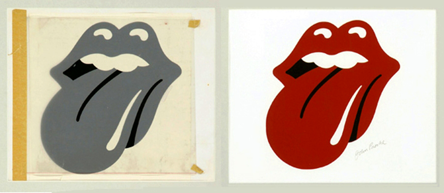
At the time he was given the task of reconfiguring the cover of the Rolling Stones’ new album for its UK release, designer John Pasche was not aware exactly what he was about to unleash upon the world. “I put together the Warhol sleeve, Sticky Fingers, for the UK because they didn’t want to use the original — the inner sleeve (of the underpants) following on from the outer sleeve — which was a shame, because I thought it was fantastic.” The Warhol image of a man’s crotch with a real zipper stuck on raised the hackles of US record stockists for technical reasons (it scratched other albums, as well as Sticky Fingers itself) and the moral majority, for reasons of taste. The now-legendary Tongue was originally just a logo for the Stones record company and letterhead: “When I was putting Sticky Fingers together I decided to put the tongue logo on one side near the track listing—I think that was really the first visible outing for the logo.” Arguably, the lips appearing as you turned the album over was a juxtaposition in more questionable taste than the underwear…

No other rock band has ever had a logo that has not only summed them up and branded them, become a stage set, huge inflatables and backdrop, but has had a life outside rock as a kind of general catchall for youth and rebellion. Worn on t-shirts by people only dimly aware of its origins, it’s an image (like, say, Che) you could easily find being worn by a remote tribe in the Amazon. It has that kind of reach. It also now exists in a taste limbo—once a salacious and provocative image, flirting with bad taste, over time it’s become as commonplace as the logos of corporate America, the Coca Colas and McDonalds of this world. “When I pass kids in the street wearing it” says Pasche “ I think, What goes through their minds, why are they wearing it? Are they fans, or are they teenagers wearing a symbol of rebellion?”
Shepard Fairey, who designed the Stones 50th anniversary logo this year, incorporating Pasche’s Tongue says, “In my opinion, [it] is the most iconic, potent and enduring logo in rock & roll history. I think it not only captures Mick Jagger’s signature lips and tongue, but also the essence of rebellion and sexuality that is the allure of all rock & roll at its finest…”
But look at it. It isn’t the Golden Arches or a nice piece of typography — it’s an isolated body part — the kind of brilliantly simple idea that could be hell to execute. “That was the task, really. And very much the way that Bob Gill, my tutor at the RCA, taught — you have the idea first and the second part is trying to visually translate that idea. There was an exhibition; a big pop art exhibition in London in 1968, which I went to when I was still at the college and it had a major influence on me. I just thought it was fantastic. I mean obviously I had known about the movement, seen bits of the work, but to see a major exhibition like that, I think it really sort of started me thinking, in lots of different ways. I think pop art was the only artists’ movement that took graphic design and made it fine art. And that was the interest for me, being a designer.”

“I had the idea immediately; the idea of somebody sticking their tongue out. The difficulty for me was how to portray that visually, as a disembodied mouth. So I tried straight on, I tried a profile, different views of it, different versions. And obviously I was trying to get something that looked a bit pop and looked a bit cartoon-y, but also something that looked luscious. And I just kept re-drawing it until I came up with the version, as it is now, the original. That’s what I presented to Jagger and he said he really liked it…”
Pasche had come into the Stones orbit whilst a student at the RCA: “I think the College was the only postgraduate design and art college in Europe at the time. I mean, we were students, but we were experienced students. And obviously Hockney having been there, it had a very good reputation. One day the lady in the office came through and said “The Rolling Stones have rung up — do you want to go and meet with them?” and it was to talk about the 1970 tour poster. And I met with Jagger in this large meeting room in Maddox Street. And that is what kicked it all off really… In my final year Bob Gill took a particular liking for the work I was doing, and was actually giving me odd jobs that he didn’t have time to do, commercial jobs. So when the Stones rang up the college and asked for a student to go along I actually had a bit of experience outside the college — I felt on top of my game, really.”
At the same time, fellow students Storm Thorgerson and George Hardie were working on the cover of Pink Floyd’s Dark Side Of The Moon. It’s extraordinary to think that two of the most iconic and lasting rock images were being created by undergrads on the same course. Of course they were all virtually contemporaries of Jagger, and as Pasche says, “I think Jagger actually looks out for new people and creative stuff.” He proved a good client as well: “He’s a very astute character, really and he’s great to deal with. He never says, “oh I don’t know.” It’s either, “I don’t like that” or “I really like that…” at that time it was quite often the musicians dealing directly with the designers and not through the record company — the musicians had more of a say on what they wanted for the sleeves.”
But, unlike Paul Rand, saying to Steve Jobs that he’d happily design a logo for his new computer company, NeXT, in 1985, and that would be $100,000, thank you very much — John Pasche was paid £50. His day job at that time was as a junior art director at Benton and Bowles, but for 4 years from 1970-74 he worked at weekends and in the evenings doing a lot of the Stones UK design projects. I ask if he felt, like Peter Blake with the Sergeant Pepper sleeve, that it was unfair? “Well you never know at the time, do you… and afterwards, when I was freelance and worked on logos, I was always very careful to register the designs and sort out the paperwork and contracts — but nothing ever came of them!”
If Pasche has a real regret (and the money issue is less of a regret since the original designs were sold last year to the V&A for a considerable sum) it’s that the graphic integrity of his work has been compromised: “Over the years it’s been redrawn a bit, and to me it doesn’t really look quite right. I think what happened initially is when the artwork was approved it was faxed over to the States and they received — well, you can imagine the black and white fax, a horrible looking thing! So obviously it had to be re-drawn but it wasn’t re-drawn as well as the original. I think that is quite often the version that you see. I find it difficult to look at the versions of it — as a designer it just irks me a bit. But I have to say; I think it has been used quite cleverly over the years in different forms on the various tours. And I think that’s probably Jagger again. It’s quite a clever idea presenting it a different way relating to a particular tour.”
And so John Pasche hosts another batch of film crews from France and Germany and Argentina, all come to talk to the man who caught lightning in a bottle and the Stones in an icon. Just in the time I was writing this I saw the tongue logo made up of small red mirrored tiles adorn a huge shop window display, I saw it on four T-shirts, and in countless magazine features on the Stones anniversary and, finally, as graffiti on a wall in a tv documentary. It will probably outlast the career of the Stones, ending up as a free-floating image, beyond taste, imbued with whatever meaning (or not) that the beholder or wearer invests in it, a kind of tongue–and-lip tabula rasa.


