Illustration, Interludes

Interlude: Anna Haifisch

From Varoom! magazine, 2017

Anna Haifisch’s twitter photo is unnerving. Her head and shoulders sit bust-like among seals in a museum diorama. And reading her latest book is equally unnerving. If you skip ahead to the last answer in the questionnaire, you’ll find out how Anna Haifisch regards the notion of rhythm in drawing. So I’ll try to avoid the word while writing about The Artist, which initially appeared as a weekly strip on vice.com.

A proxy for all struggling creatives, the strip is full of painful situations. Here, the excitement and unfettered creativity experienced at art school runs smack bang into the ugly realities of life, from the failed attempt to shrug off internet browsing – so work can actually be done – to the jealousy that colleagues’ success provokes.

artist

Talking to herself and her peers honestly is what Haifisch’s The Artist does. In it, her bird-like character, thin and pale, travels through the world of commissioning editors and gallerists, never at home, never at ease. Anna herself invokes Steinberg, Tove Jansson and Walt Disney as influences. Occasionally, a title page of a new strip will reference great art – Matisse, Munch, Caspar David Friedrich – as a background for The Artist to appear in, each done in the shaky line that characterises her style.

Haifisch gets a lot of mileage for a straightforward six-panel page formula with limited use of text. “I think repetition is essential for comics. I don’t know how many times I’m drawing the same thing. From panel to panel, making sure the reader can follow my thoughts. You can’t be lazy; there are no shortcuts to repetition.”

She marries her penwork to an unusual colour palette, which partly came about from her work as a screen printer. She spoke to one interviewer of her colour rules: “Don’t use red, yellow, blue and green together unless you want your work to look like an ugly children’s book – get rid of at least one of them (Goodbye green.) / Use the colors that’ll emerge when you mix them (that’s where the purple and pink are coming from) / Pick one colour that bites one of the chosen colours from above and add it to your palette (here and there you’ll find an awful brown in my work).

Haifisch goes for the big themes, too: “The religious or mythological tone is my favourite part of writing The Artist. It’s pure honesty. When I talk about artists as saviours and saints, I really mean it (and every other word, too). It’s me giving a speech. I deeply believe that art is mankind’s last straw before it sinks into brutality and chaos. If we let go of art, the world is lost, and we will all die not soon after.”

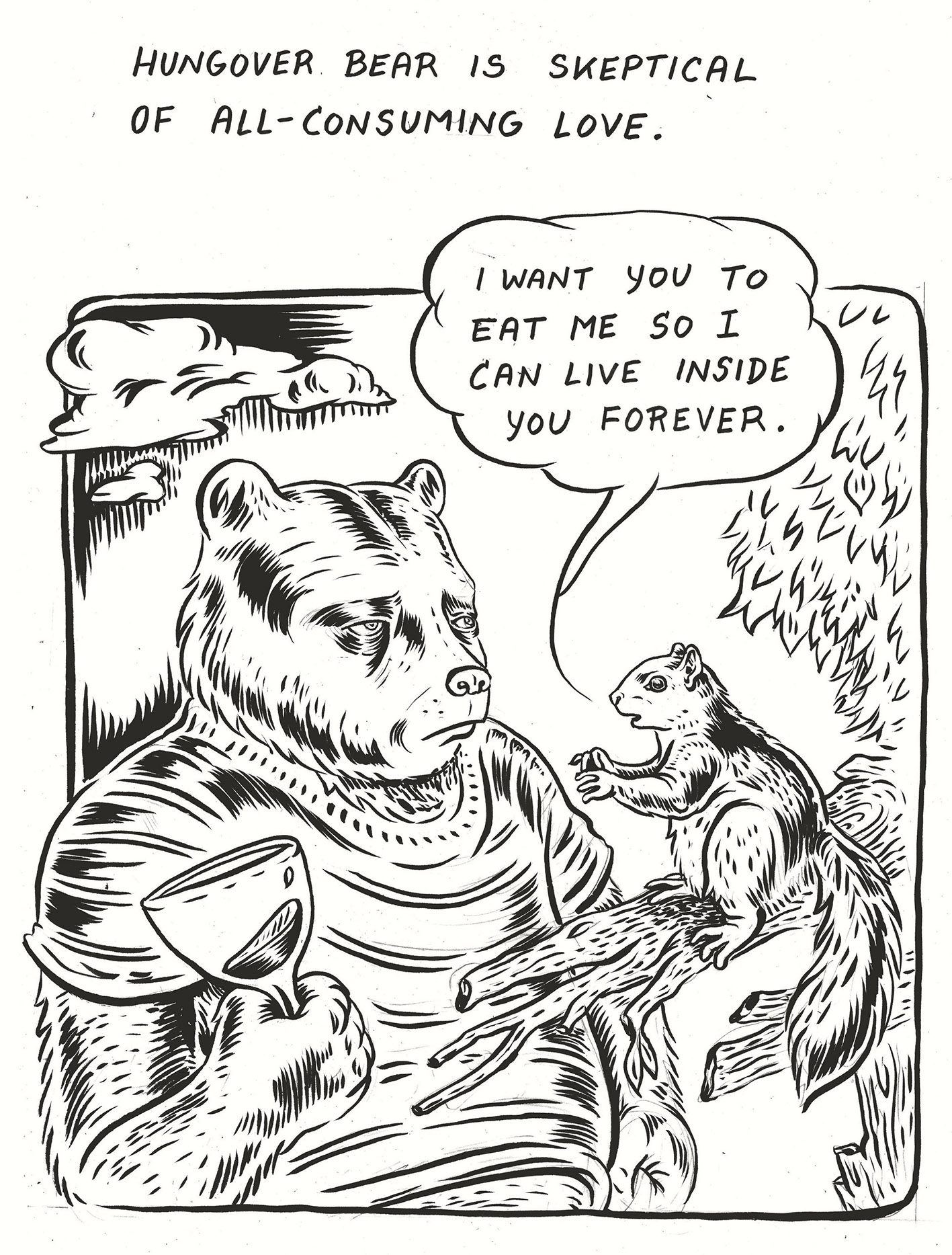
It’s funny, acute and smart, but like many great strips (Matt Groening’s Life is Hell, Bob Burden’s Flaming Carrot, Ali Fitzgerald’s Hungover Bear) she captures the secret melancholy of a life examined, and what at first appears simple slowly begins to reveal its complexities. The saddest frames are the ones that have no words, where the viewer effectively reads ‘between the lines’ to feel the awkwardness and loneliness The Artist trades in.

A Q&A with Anna Haifisch

Materials: Dip pen, ink

Research: Haikus, BBCs’ The Nation’s Favourite Poems, comic books, friends and art shows.

Process: Going to the studio around eleven to see what’s up. Bohemian style. No steady rhythm. I work pretty much every day and like working late. But I don’t like to call drawing work, because it doesn’t feel like it.

Resistances: Drawing comics can be very boring. There’s too much repetition involved. I like to change it up with drawing other things. Also, I like to do some printmaking from time to time.

Insight: The Artist transformed from a flat character on paper into my mate. We really became friends over the last two years. I care for him a lot. Often enough I feel bad for him for throwing him into all these horrible situations.

Distractions: The internet, emails.

Numbers: Six panels per page, three pages per comic. That’s pretty much the maximum of attention the reader is willing to spend on an online comic.

Rhythm: I find it repulsive when people talk about a ‘rhythm in the line’. I think that’s the worst one can say about a drawing. Then I always picture an artist wearing a poncho and dancing barefoot in the studio. Swinging a wet brush.

*The quotes are taken from an excellent interview with Shawn Starr and Oliver Ristau for the blog Left Me Wanting More. [leftmewantingmore.blogspot.co.uk/2016/09/unleashed-in-east-interview-with-anna.html]

There’s also a video here of Anna talking at an It’s Nice That event.

Reprinted by kind permission of Varoom!

Standard
Illustration, Interludes

Interlude: Ali Fitzgerald

From Varoom! Winter 2016

Let me introduce you to your new favourite cartoonist: her name is Ali Fitzgerald and she moved to Europe after grad school in Austin, Texas and is now perched high above the Berlin wall in a bungalow, where she draws her regular cartoon column for McSweeney’s, “Hungover Bear and Friends.” It came as a result of winning their annual Column Contest, and is about, well, a hungover bear and his friends (Entitled Fox, Catty Curator et al) confronting the strangeness and quirk of the modern world. As the website puts it, “he’s not an anti-hero, he’s just a bear in a sweater trying to make it all work.”

bear


Moving from the home of outlaw country musicians and the South By Southwest festival to the art cauldron of Berlin was not carefully thought through. In fact, as she says, “I basically left Texas with the complete absence of a plan or any German skills.” She also moved from large-scale wall paintings and dioramas to a much smaller canvas: “I was burnt out and disillusioned with the “high art” world and wanted to engage in a more direct way of telling stories. I had to really teach myself how to work on a small-scale – working in a large, gestural way comes much more naturally. But when I moved to Berlin I knew I wanted to learn how to work smaller, and how to communicate ideas visually. So I made a lot of weird/dark comics and drawings that I will probably never show anyone except my therapist.”

For Ali, Berlin actually isn’t so alien. “I think I’m more ‘European’ in temperament (reserved, kind of dark, fatalistic), so Berlin has always felt less foreign in some ways – and despite its rocketing hipness, it’s still essentially a city of outcasts.” Which is, of course, part of the stock-in-trade of cartoonist – an outsider’s eye on the absurd way the human race works. There’s something of Charles Burns in her style, and of Roz Chast in her language, but “Hungover Bear” has a tone and timbre all of its own.

You can see the series so far on Timothy McSweeney’s Internet Tendancy (mcsweeneys.net/articles/the-twisting-road) and laugh/wince in recognition, at the caustic Ant Rand – “Never forget that the finest nectar comes from egoism, industry and the invisible hand of the Free Market” or be told that “Self-Righteous Hawk thinks that you don’t fully understand the situation in Gaza.”

fox

Reprinted by kind permission of Varoom!

Standard
Illustration

Steven Guarnaccia’s Fatherland

Written for the Summer 2015 issue of Varoom! magazine. The theme of this issue was Play.

My normal beat at Varoom! is cartoons and comic strips, but sometimes you come across projects that, while being informed by comic drawing, are a step aside or beyond. On leaving Fatherland, Steven Guarnaccia’s exhibition of possessions re-purposed into an amazing portrait of both father & son, I knew that I had to write about it. Actually, the first thing I had to do was email Steven – who I’d recently worked with – and tell him just how fantastic it was.

guarnaccia_fatherland-4

This vivid picto-biography, using his father’s possessions (saws, pipes, shirts, dice) turned on their heads by colour, wit and wordplay – in order to portray facets of the character of the man – is brilliantly realized. Giant paper ties hang from floor to ceiling, and plaid shirts are painted on blocks of wood in a space created by white cardboard cartons. Of course, the acts of the son – whether by filtering or emphasis – give the show another dimension. At certain ages he’s in awe, at others puzzled or in opposition, and so it becomes a story of both men, playful in approach, but with the sharp edge of honesty.

guarnaccia_fatherland-33

Amusing and moving in turn, Fatherland has a coherence and satisfaction that exhibitions often lack. It may be that if you’re a certain age and have had your own issues or struggles with your father that it resonates in a particular way, but actually it’s hard to think that anyone could fail to enjoy or take something from it. And moving and amusing is an unbeatable combination – if you have the skill to pull it off. Which Steven does.

[See below for a Q&A with Steven].

guarnaccia_fatherland-21 guarnaccia_fatherland-40 guarnaccia-3 guarnaccia-8 guarnaccia-18 guarnaccia-27 guarnaccia-36 guarnaccia

The Varoom! Q&A with Steven Guarnaccia

Brief: Brief to self – write a children’s book during sabbatical from Parsons. Instead, I drew saws and pipes and shoes incessantly, until I gave up on the book and decided to give in to the saws, etc and build a world of objects that all deal in some way with my pretty broken relationship with my father.

Materials: The aforementioned saws, pipes and shoes, plus scraps of wood, acrylic paint, canes, shirts, various boxes, a mannequin leg and a duckpin bowling pin.

Research: More than 10 years of therapy, endless poring over the family photo albums and scrapbooks (I’m the keeper of the archives), delving into sign painters’ manuals, and the Oxford English Dictionary always at my side.

Process: Haunting flea markets and yard sales on two continents and drawing in my sketchbooks for two years, then one year of cutting and painting and hammering and gluing.

Resistances: The difficulty of finding a voice to depict a relationship that alternated between silence and roaring, fear of exposing that relationship to the world, and finding a way to represent it fairly honestly and unsentimentally through objects, rather than through my usual humorous drawings.

Insight: I really like making three- dimensional objects!

Distractions: Haunting flea markets, buying way more saws than I’ll ever be able to do anything with.

Numbers: 16 pipes, 14 saws, one bowling pin, one artificial leg.

Play: I often felt like I was playing some surrealist’s game of pin the tail on the fur-lined teacup, combining objects in ways that were illogical but emotionally resonant.

Standard
Interludes

Interlude: Lucas Varela’s Imaginary

From Varoom! 20, Spring 2013

Glance at Lucas Varela’s Blog/Website ESTUPEFACTO and you are assailed. Assailed by a vivid mosaic, beautifully coloured and teeming with—as he himself puts it—an “imaginary of monsters, worms, vomits and semi-naked women.” Kudos, then, to the Financial Times Weekend Magazine’s design team (headed up by Mark Leeds when they redesigned in 2010) for looking beyond the comic book patina to the brilliant narrative strength below when they chose him to illustrate a regular column by Robert Shrimsley—The National Conversation. There is something particularly satisfying as an Art Director to pair two people—one visual, one verbal—and create a partnership that lasts. In the 1990s, Simon Esterson and I put together Jonathan Meades and Paul Slater for the Times Saturday Review and set in train a double act that lasted for twenty years.

In the Shrimsley/Varela case, the Weekend art team were aided by Lucas’ agent. Mark Leeds: “Helen from Dutch Uncle alerted me to him—I’m always very happy to give talent a chance. I thought his illustrations had wit and a sense of narrative so I felt confident he would be able to articulate the column.” So far, Lucas has illustrated over 100 of the columns, a fact that was celebrated on the FT website last December.

Helen Cowley, Dutch Uncle: “On a trip to London, Lucas came to our studio, shared his comic work, and not long after we started to work together on some commissions. Mark Leeds, a friend of mine, approached us about a new column in the FT. I knew Lucas was keen to get his work seen more in the UK and it seemed like a perfect fit. He’s a great artist and draughtsman and has an amazing imagination and wit.”

Hailing from the Buenos Aires, Argentina and now in artistic residence at La Maison des Auteurs in Angouleme, France, doing a graphic novel, Lucas enjoys his regular gig: “I’m in contact with Paul Transley and Shannon Gibson from the design department and the writings of the journalist Robert Shrimsley are brilliant and funny. I try to accompany them with humor and ironic illustrations. I just always hope they can print it a little bigger…”

Lucas1

Two of the many illustrations Lucas has done for Robert Shrimsley’s column

For Varoom, Lucas pulled out a portrait that he had done for XXI magazine and let us into the thought process behind it. The theme for this issue was Rules, hence the last question.

Process1

Materials  Pentel Brush pen, Pentel Fountain pen and other cheap pens on A3 paper.
Research  As it is the portrait of a public figure (in this case the boxer Dewey Bozella), I searched for photographic references on the Internet. I didn’t move so much my ass—I just googled it. But I also read about his life, and I saw a documentary about him that really moved me.
Process  The magazine XXI asked me to do a portrait reflecting the life of courage of this man who has spent 25 years in prison for a crime he did not commit. Every time they asked him to declare himself guilty to shorten his sentence he refused. A lawyer discovered evidence that proved his innocence, so he was freed at the age of 50 years. He fought only one boxing match as a professional, as he had reached the permitted age limit, and then he retired—it’s a very touching story and I was very enthusiastic to illustrate it. I began with a lot of roughs, searching for the correct position and mood. I did a serious portrait with a halo of light like a religious icon. But the art director felt it too solemn for the cover and asked me to do it with a little smile. The inclusion of the beret also helps to correct the mood.

Process2
Resistances  Well, I am a comic artist, so it was a challenge to do a portrait with realistic results. I had to resist the use of my usual imaginary of monsters, worms, vomits and semi-naked women but in the end I’m pleased with it.

Process3

Process4
Insight  I did all the process and final illustration in a trip I made to a very little town in the south of France called Lauris. We had this trip arranged to visit my girlfriend’s father and I was afraid I was not going to be able to do the illustration without the accommodations of my studio. So I took my pens, paper and the computer and the only thing I purchased was a portable LED light table. This proved to be very useful. At the end I worked comfortably with my portable equipment in this very nice town surrounded by fields of olive trees.
Distractions  Not so much, because my internet connection was limited and I only used it for the research. The only real distraction was a very strong wind called the Mistral that attacked
the town and brought down some trees.
Numbers  The illustration was made for XXI and it was the 21st issue, so it was important not only for the numbers but for the manifesto they publish with it, in defense of independent journalism. I was glad to be part of it.
Favourite Rule  I drink mate (a strange South American beverage) when I work. I have a lot of accidents with the liquid and the original pages.

Standard