
John Alcorn: Evolution by Design
Written by Stephen Alcorn & Marta Sironi
Designed by Marina Del Cinque
Moleskine, £40, €49, $64, Hardback
moleskine.com
Written for Pulp magazine, 2015

This beautiful book, printed on Fedrigoni paper, is one of Moleskine’s continuing series of publications that offer “insights into the creative processes of noted artists, designers, writers and architects”. It presents an extensive collection of the work of the talented and innovative John Alcorn, who graduated from Cooper Union, New York’s prestigious design school in 1955, and went on to find an early kind of fame working with both Push Pin Studios and Lou Dorfsman at CBS. These talented and switched-on collaborators had high profile clients in advertising and media, especially in the burgeoning world of TV, and Alcorn’s work was a perfect fit, rich in both wit and style.
At a time when illustrators were becoming interested in type and letterforms, and designers had a real feel for drawing as decoration, Alcorn was perfectly placed. The mixing of vernacular typography, languid and expressive human forms and vivid, over-the-top patterning, quintessentially evoked by Alcorn, would come to define the visual language of the Sixties.
But there was much more to him than that. In his intimate text, John’s son Stephen, himself an artist, calls his father’s approach, “in essence artisanal; at its root lay highly-sensitive eye-mind-hand coordination”. Milton Glaser characterised him as “the baby-faced design prodigy with the golden hands” while Ed Sorel, another of Push Pin’s founders, interestingly saw him as “wildly ambitious, intricate, and jolly”, a collection of words not often seen together. He had a graphic designer’s eye for how a magazine page or a print advert should work, and this made his image-making dynamic as well as smart – he was, in Lou Dorfsman’s words, “an art director’s illustrator”.
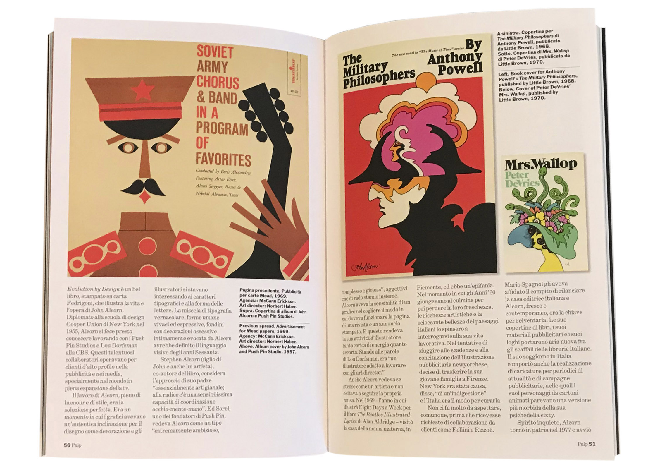
That he may have been, but he saw himself, equally, as an artist, and was not afraid to follow his muse. In 1969, the year he contributed “Eight Days a Week” to Alan Aldridge’s The Beatles Illustrated Lyrics (and probably influenced the animated film, Yellow Submarine), he visited the home of his maternal grandmother in Piedmont and had an epiphany. As the Sixties peaked and then soured, the artistic wealth and stunning landscapes of Italy made him question his working life. In a bid to escape the deadlines and frenzy of commercial illustration in NYC, he uprooted his young family and moved them to Florence. New York had brought on, he said, “a case of indigestion” and Italy offered the cure.
It wasn’t long, however before his personal work led to his intray being filled by offers from the likes of Fellini and Italian publishing house Rizzoli. Mario Spagnol had been given the task of re-launching Rizzoli, and Alcorn, fresh and contemporary, was the key to this reinvention. In the way that Jeff Fisher’s work was crucial in defining Bloomsbury in its early days, Alcorn’s book jackets, advertising material and logos introduced a new look to the shelves of the Italian bookstore. His time here also involved caricatured covers for political magazines and a few carefully selected advertising campaigns, where his cartoon-like characters feel like a softer version of his Sixties psychedelia.
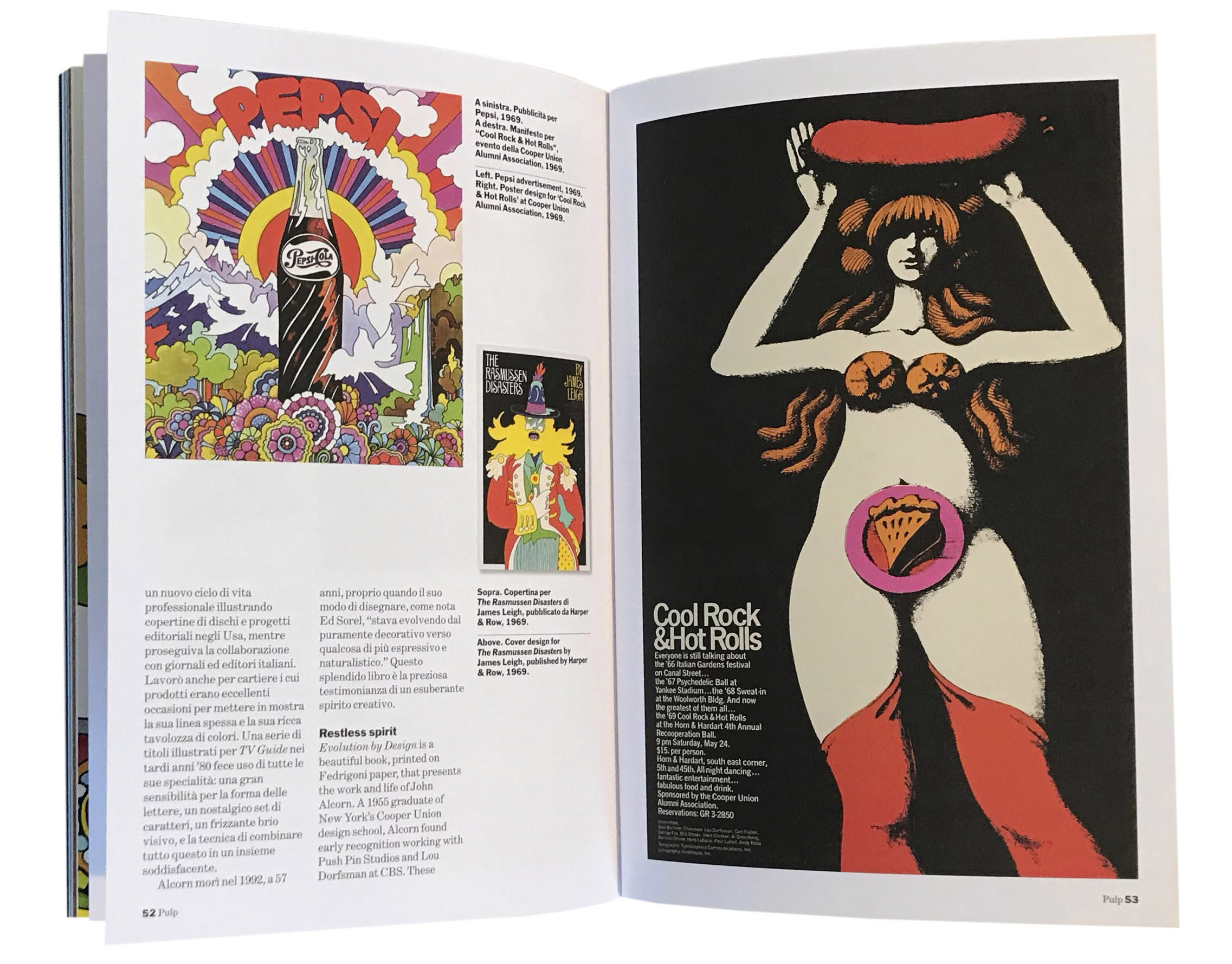
A restless spirit, Alcorn moved back to the States in 1977, beginning a new period of freelance life, illustrating record covers and editorial projects in America, while still doing design jobs for Italian newspapers and publishers. He also did a large amount of work for paper manufacturers, whose services and products were excellent showcases for his bold line and pleasing colour palette. His series of illustrated titles for TV Guide in the late 80s used all of his talents in one job: a way with letterforms, a nostalgic set of characters, sparkling visual wit and the technique to combine it all into a satisfying whole.
He died in 1992, at the early age of 57, as Ed Sorel notes, “just as his drawing style was evolving from the purely decorative into something more expressive and naturalistic.” This lavish book is an excellent overview of his life and work, and a beautiful testament to a roaming creative spirit.

Reprinted by kind permission of Pulp.

Thank you, Martin, for sharing this lovely article, which made me aware of Alcorn’s work. Quite often when Pushpin Studios are discussed, it seems that Glaser and Chwast get most of the praise or attention (no doubt justified), while the equally groundbreaking work of the other members is either sidelined or not examined with the same fervor. This book has now been added to my ever-growing reading wish list.