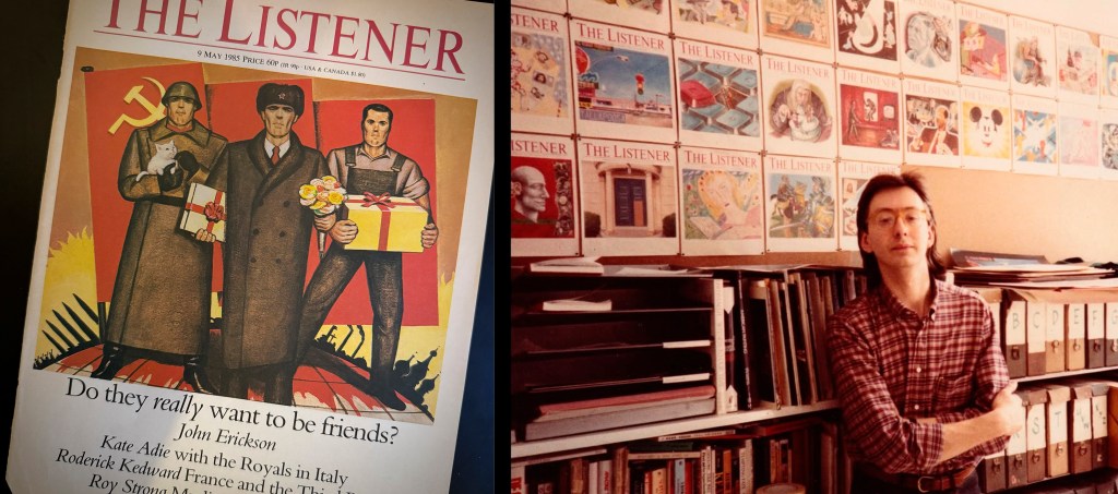


You can download the catalogue from the Catto show here:


You can download the catalogue from the Catto show here:
In a “30 years ago” frame of mind, here’s a brief post in the hope that some readers of Adventures in Commissioning would be interested to see (or support) Lucinda Rogers’ wonderful drawings of New York over the last three decades.
“In my career as an illustrator I’ve worked for many different companies, publications, and organisations including the New Yorker, New York Magazine, the Guardian, Times and Telegraph; the Victoria and Albert Museum, Bloomberg and publishers Penguin, Bloomsbury and Little, Brown. This often means being sent out to draw people, places and things: the practice known as ‘reportage’. But the New York drawings were not commissioned by anyone. They are my own project…”

Beautifully designed by Simon Esterson, there are 8 days to go to fund the last £10,000 needed for the project to become a reality.

Find the Kickstarter page here.
I learned more about collaboration and commissioning in the three years that I worked for David Driver than at any other point in my career. It was about finding talented people and letting them bring their gifts to whatever project you were working on. It was about enjoying your work. It was about honing your skills.
in 2014 Simon Esterson and I went to David’s house to talk to him about his career, with some vague thoughts about the fact that he had never really been profiled. There was an excellent two-part post on Mike Dempsey’s wonderful Graphic Journey blog, and some pen pictures in various books about the Radio Times, but not much of significance. That was odd, as he had given many well-known designers and illustrators important breaks in their careers. I had talked to David when profiling his long-time colleague Peter Brookes for Eye, and Simon was certain that it would be valuable to at least start a conversation with David.
We had a riotously enjoyable meeting that lasted four hours and left with hilariously unrepeatable stories about working for the BBC, The Times and the radical press of the Sixties. It would take four years before it made it into print, bolstered by two more equally enjoyable meetings. The profile finally found a home in the second of two issues of Eye devoted to Magazines, which came out in November 2018.
I talked to various designers and writers about David, and parts of what they emailed me were used in the profile. The great English designer Robert Priest, who has mostly worked and lived in New York wrote a very thoughtful and punchy piece about David’s influence, which I’ll run in full here. Priest worked with David Driver at Welcome Aboard and Radio Times.
“The role of the editorial art director in Britain changed in the 1970s. It was influenced by the work of Tom Wolsey at Town in the 60s but was more fully realized a decade later with the emergence of a new breed of art director who was not just a visual journalist but a bona fide journalist in all senses of the word. They were well educated and savvy and wanted more of an influence on their magazine’s content. Leading the charge were Michael Rand and David King at The Sunday Times Magazine, David Hillman at Nova and David Driver at Radio Times, the journal of the BBC.
“As a young designer at the time I was tremendously excited by their work, and that of their American counterpart, George Lois at Esquire. I was fortunate enough to become a magazine art director (back when it was the top title in the art department) at the age of 23 at Conde Nast’s Wine & Food and did my best to learn on the job until I met David Driver a year or two later. David had created an in-flight magazine for BOAC for Cornmarket Press and was doing things I’d never seen before. He combined a big picture vision with an attention to detail that was incredible.
“I went to see him on Conduit Street and found him be a larger-than-life character. Tall, with long curly hair and extremely funny, he welcomed me into his world. David always kept a small coterie of lieutenants around him. People he trusted. Just as he did with artists and photographers, always a limited roster of contributors who understood his vision. I wanted to work for him, despite being a number one already, because I wanted to observe his process and to find out how he came up with such great ideas, but there were no jobs available at the time. Soon after, however, David joined Radio Times and recommended that I follow him as art Director of Welcome Aboard. He didn’t interfere from afar but I always felt his support and influence.
“In 1975 I had my own design consultancy and David asked me to redesign the TV and radio listings in Radio Times. One thing led to another and I went to work for him at last. I became one of his lieutenants.
“David worked very closely with the editor, Geoffrey Cannon to fashion the content of the publication. It was a double act and they were a formidable couple. They demanded that stories be conceived both editorially and visually from day one. David would expect complete information from the other editors at the magazine when we started working on a feature. If it wasn’t delivered precisely David would crush the editor with frightening efficiency. In more than a few instances they were unable to respond at all, having not thought the idea through, and were forced to skulk out of David’s office, often in tears. Not pretty but extremely effective.
“In 1977 David was offered the job of Art Director of Weekend Magazine in Toronto. After much thought, he decided to turn it down, but a mutual friend recommended me for the job and I was pleased to accept. I would try to put what I’d learned under David into practice. I’ve been trying ever since.”